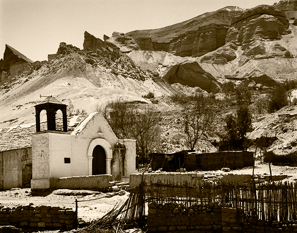
Church at Vitor (gratuitous image by the author, unrelated to the post)
Color is Easier Than B&W, But B&W Is Easier Than Color
As mentioned in the previous post, it is far easier to achieve a technically satisfying print in color than in B&W. That is because color contrast saves many photographs that would not succeed as straightforward B&W images. In this sense, color photography is much easier than B&W. But when one is attempting to reach the level of art, B&W is a far easier, and more flexible tool than color.
This is easy to explain. The overriding unique quality of the photograph is its illusion of reality. To destroy that illusion is to lose the best tool a fine art photographer has. As long as you can leave the viewer convinced that what he sees is/could be, real, you have maintained the integrity of the illusion.
The Following Interesting Information Added 11-01-2014…
There is nothing new under the sun. In another post, I recommended a couple of books including Pictorialism Into Modernism… where a few minutes ago I read (pg. 98) this sentence written by Gordon Aymar, and quoted from the 1924 Art Directors Club annual:
“… On the other hand, forced beyond the limits of its (the photograph’s) own inherent characteristics, it becomes false and loses that sense of reality which is its chief asset.”
Andenes (yet another image unrelated to the post)
But B&W Is Easier Than Color
With B&W, you can stretch an image a great deal and still maintain believability because the viewer has little basis to determine what gray tones might have existed in the original subject. The most common/popular manipulation is to darken skies. In reality, the sky is usually brighter, quite considerably brighter, than most anything and everything on the ground. But the human eye sees the deep blue of the sky as dark and therefore, readily believes a dark sky in a B&W photograph. Only on rare occasion is the sky actually darker than the ground.
Current practice among color photographers using digital tools seems to be to push the saturation slider as far to the right as it will go. This results in a gaudy, obviously manipulated, though attention grabbing image that has completely lost the illusion of reality a fine art photograph depends upon. (It does however, seem to sell well in shopping malls.) Because this illusion must be maintained, the manipulation tools available to the fine art photographer working in color are generally far more limited and therefore make the job of working in color more difficult. Very few can manage to do genuinely good work. Those who can, deserve full credit for the achievement.
With digital images destined to be monochromatic, colors can be saturated to the point of absurdity, yet once hidden behind a B&W layer such obvious extremes are completely disguised.
This is not to say that in order to fall under the heading of art a photograph must depart from reality (what people think is reality), but it is certainly easier and is a frequently employed tool. Rare indeed is the B&W photograph that has not been manipulated in some way to produce the result the photographer envisioned when the image was captured, even if only dodged and burned.
In a B&W image, people will believe even the greatest extremes. Trees ranging in tone from pitch black to the near-white produced by infrared films can all be acceptable illusions. Not so in a color photograph.
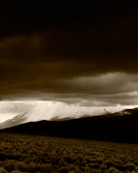
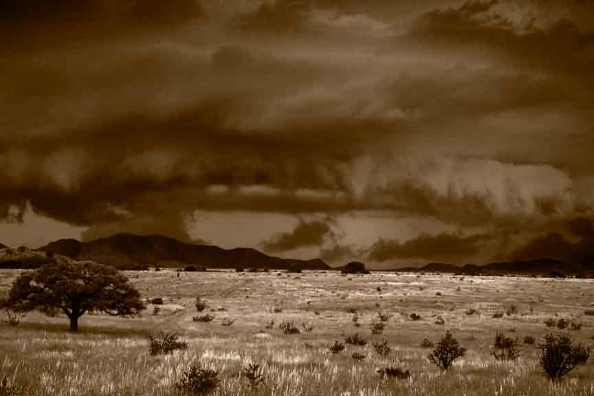
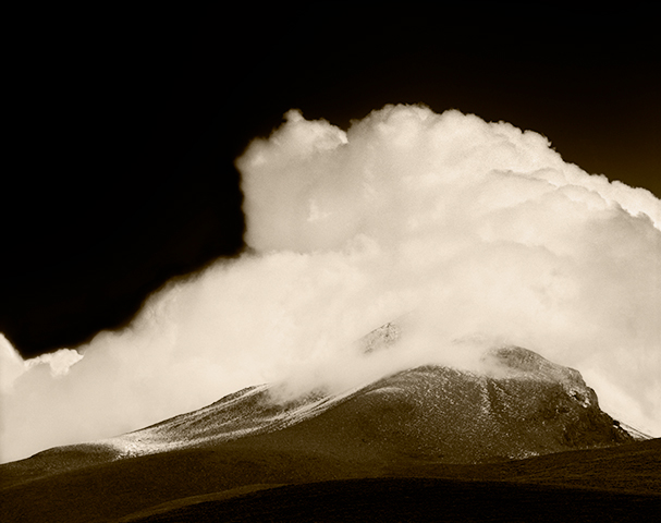
Clearing Storm Behind El Misti (all gratuitous images from Arequipa, Peru, late 1980’s)
Conclusion
It is easier to do good work in B&W because there are more tools and possibilities at the artist’s disposal for manipulation, but it is harder because the B&W image is so technically demanding. It is harder to do good work in color because there is so little that can be done to alter a color image and have it still remain credible, but it is easier because a color image provides the easy slam dunk of color contrast, that makes just about any print pleasing to the eye.
Some twenty-plus years ago I wrote a magazine article titled The Primacy of Local Contrast (it can be found in the list of monographs on the right hand side of the page to which that link leads). It was an enormous hit at the time. Kind of a buggy whip today.
Don’t get too wrapped up in that article. It deals with techniques and approaches that have largely gone by the wayside. Unless of course, you are still using film. Then, by all means.
A blog on photography needs photographs. Here’ one that is completely unrelated to the topic Tone And Contrast In A B&W Photograph, at hand (almost). Just shot it today.
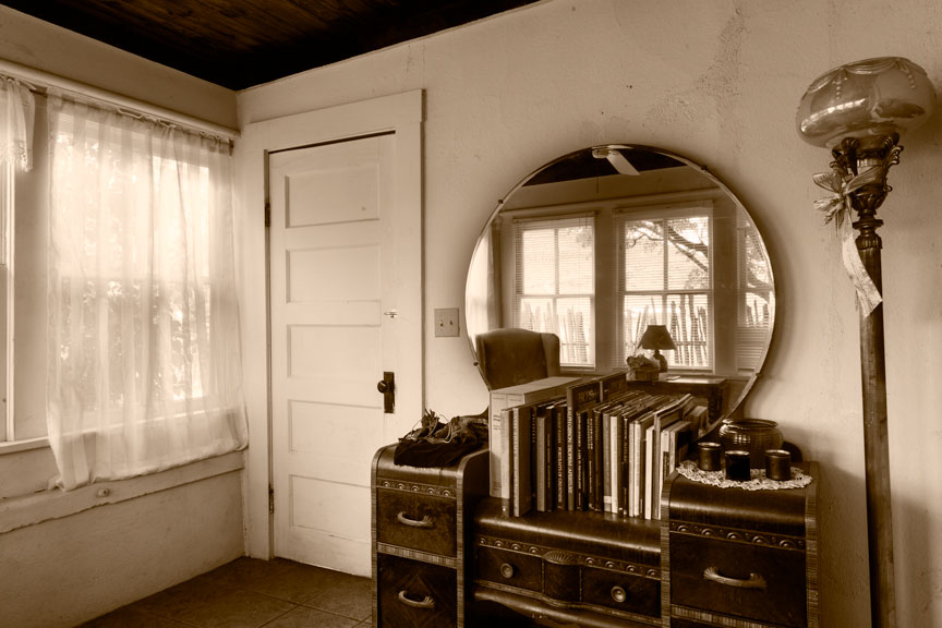
Winter Porch (just one of the really cool rooms in this wonderful old ranch house)
But the basic concepts of that article are still equally valid, if not more so. The B&W photograph is all about tone (brightness), contrast, and the relationships between tones. Most people don’t understand this. Without color, there is nothing but brightness and contrast. That’s all. The B&W photograph is about control over just those two things, but it’s a great deal more difficult than it sounds.
Color Contrast
This is why it is so much easier, in some respects, to pursue color photography. A color photograph has the added advantage of what is referred to as color contrast; the visual contrast between different colors. Two different image areas can have identical gray tones when photographed in B&W but radically different colors. A color photograph can be quite low in overall contrast and quite uniform in gray tone, yet still be appealing because of color contrast. Here is a practical example.
Color Contrast Only (All other forms of tone and contrast have been removed.)
When desaturated (remove all the color), the above image is all exactly the same gray tone; no contrast, no differences in tone, just one big gray rectangle. (I just tried it with the jpeg pulled off of this web page and something in the process of converting the Photoshop image to a jpeg leaves a hint of difference in the grays, but in the original, they are all identical.) This makes it easy to see how a photograph can be successful using only color contrast and how the same photograph in B&W could be no photograph at all.
This also demonstrates why it is less difficult to create a technically successful photograph in color than in B&W. In many cases, if you remove the color, there is little or nothing left. A B&W image requires different gray tones and of course, contrast. A color photograph can succeed on nothing but the colors.
Tonal Relationships
Below is an example of a teaching aid popular in how-to art books and classes. The question accompanying these illustrations is always, “In which view is the gray tone darker?” In reality, the gray tones are exactly the same. Adjacent a white tone it looks darker, the opposite being true when next to black. The point is not to be clever but to show how human perception varies depending on what surrounds a tone or color. In other words, to demonstrate the extreme importance of tonal relationships in a photograph or painting and how it can effect the final outcome. I have always felt this subject deserved far more in-depth discussion than it usually receives.
Tone comparison 1Tone comparison 2
Lest the reader underestimate the importance of tonal relationships in a photograph, in particular a B&W photograph, I refer you to the work of a brilliant contemporary fine art photographer, Carl Chiarenza. Mr. Chiarenza’s work, especially those images involving nothing more than pieces of torn paper, clearly shows the supreme importance of tonal relationships. In those cases involving unrecognizable subject matter/materials, there is little or nothing in the photograph but the relationships between tones, yet the photographs are clearly very successful. To understand Chiarenza’s work is to understand how and why photography can rise to the level of art. To paraphrase the great Minor White, ‘a fine art photograph is at once a photograph and yet, more than just a photograph’.
Overall and Local Contrast
Leaving out color contrast, since we’re talking about B&W photographs, there are only two types of contrast: overall contrast and local contrast. When people discuss contrast, they are usually referring to overall contrast. Overall contrast is assumed by many to be the range of tones from black to white, but that is not correct. Overall contrast is the rapidity with which tones change from black to white. The fewer gray tones in the middle, the higher the contrast. More gray tones in the middle and even the elimination altogether of the extremes of black and white, constitute low overall contrast.
Statements like “I like a lot of contrast in my photographs “, are a dead giveaway. Leaving out gray tones in the middle, for a stark image that is made up mostly of very dark and very light tones is not usually the path to a good image. A full range of gray tones with pleasing tonal relationships is far more often associated with success.
At this point, someone is likely to ask, “What about detail?” Well, there was certainly detail in the subject that appeared in front of your camera, but the only detail in your photograph is in the texture of the paper, assuming there is any, on which you printed it. Detail in the image itself is represented by differences in tonality within gray tones. More specifically, by what is called local contrast.
Think of a stucco wall in direct sunlight. The differences in tonality you see there in the texture of the wall constitute what is correctly termed local contrast. If sunlight rakes across that wall at an angle, the local contrast is more pronounced. If a cloud passes over the sun, blocking direct sunlight from the wall, local contrast is markedly reduced.
The Primacy of Local Contrast
When someone remarks that he likes a lot of contrast, he is most often really referring to local contrast and not overall contrast and indeed, local contrast always plays a key role in the success or failure of a B&W photograph.
Every image has one or two areas in which local contrast must be correct for the photograph to succeed visually. This is usually the area of primary visual interest, but not always. In that old article, I coined the term key contrast core for this part of an image. (In hindsight, I think I could have come up with a better term.) Once contrast in that part of the image is correct, the rest of the image can be constructed around it, if necessary, but often falls into place largely on its own. One can get away with a great deal in a B&W photograph, but if the key contrast core is too harsh or too flat, the photograph will simply never work, regardless of what else is done.
By the way, the key contrast core above, in that photograph of our winter porch, is the front of the dresser.
This is why that old article was called The Primacy of Local Contrast. In a B&W photograph, the number one technical hurdle is to get the local contrast correct in the key contrast core.
In conclusion, and as a lead in to the next post, it is much harder to achieve a technically good photograph in B&W than it is in color. But it is much harder to rise to the level of art in color, than it is in B&W.
The dogs (we have three) got restless this morning. Of course! It’s Sunday and I wanted to sleep in. Got up to put them out. It was still dark and I heard some very intense munching coming from one side of the yard. I thought Wendy had gotten hold of a bone (never in short supply on a cattle ranch, she loves them, but they always give her doggy-rrhea). The more I listened, the more it sounded like Wendy might have been the munchee! The muncher sounded more and more like a T-Rex. I was hearing massive jaws crushing something very substantial. I went back inside to find a flashlight, came out and directed it where I thought I would find Wendy. She was there, but…
A few feet from Wendy were four rather large feral hogs just outside the fence of our yard, calmly chewing away on who-knows-what. They appeared to be a couple hundred pounds each, and didn’t seem the least bit bothered by me shining a bright light directly in their eyes. Usually, feral hogs run the instant they think a human is anywhere near them. These didn’t even look up. Never skipped a munch. Got the dogs back in quickly before pig and dog got into a shouting match. Feral hogs can be extremely dangerous and Wendy has far more courage than sense. I thought she was going to challenge them, but she never did. Lucky for all concerned.
Encircled
In one of my first posts (“Everybody Has To Go To Work“) I reported a less than optimal result for that day’s photographing and showed a couple of afternoon images that I said were better than the morning’s take, but still not worth spending ink and paper on.
Well, I have learned over the years to go back over old work and always take a second look. Never throw anything out. Occasionally a gem is found amongst the rejects you correctly bypassed the first time and good images aren’t so common that any of us can afford to overlook one. In particular, if you start out the day capturing poorly seen images, improved work that might occur later in the day may be seen through eyes already tainted by disappointment. That was the case with this capture…
The first couple of looks at this image were not at all encouraging:
Encircled
A desaturated version looked like this:
Encircled (simply desaturated) not at all encouraging
NB: Desaturate images temporarily to get an idea of what is there tonally, but always revert to color. Remember, you need those colors for full control of gray tones.
A later review made me try a few test prints…
The results looked promising, but I just couldn’t get the sky right. In particular, the area of the circle of cloud on the far right that is brighter than the rest of the circle, I felt needed to be brighter still. Everything I tried gave what seemed to be too much or not enough brightness and it all looked artificial. Then I realized that was the wrong direction for this image, tried a test print without any alteration of that area. That was better. Finally tried just slight darkening and that worked.
Above the cloud ring the sky was very flat and lifeless, so a lot of contrast increase and burning was required. The foreground needed a heavy increase in color saturation so that contrast could be added there too. Otherwise it was quite lifeless also.
Encircled (finished image)
Above is the final print of Encircled, printed on a cold press watercolor paper, a brand called Quiller, which is sadly no longer available. I have a small stock of it remaining. (Virtually identical to Arches Cold Press, Quiller is/was slightly warmer and of course, less expensive.)
I’ve spent the last couple of weeks working up and printing some of the images shot here on the ranch over the last few months. Encircled went from being a complete reject, to one of the images I am more pleased with from those I have printed thus far. You just never know!
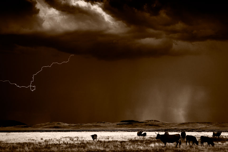
Cattle & Lightning
Here is another image that was found on a second chance tour of my files. I shot this a couple years ago and didn’t do anything with it until this past week.
Cattle and Lightning
Will show more final images over the next few posts.
I am thinking about making some videos of the process of making a print. Maybe post them on youtube and insert them into posts here. Don’t know how practical or difficult this might be. Getting to a final print is a very intense process for me, almost meditative and I am not at all sure that interjecting the video-making process might not just interfere too much, or cause me to lose track of my thought process.
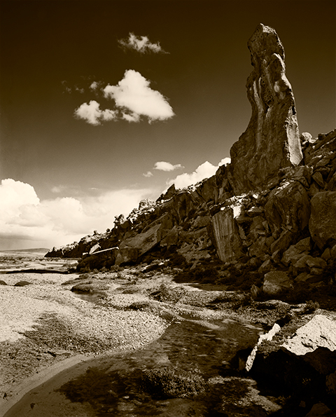
Stone Forest Obelisk (Department of Arequipa, Peru late 1980s)
It is a constant source of amazement, and provides a degree of entertainment too, how frequently I hear remarks about photographs being faithful to the original scene, as if that were somehow possible. The doctrine of straight photography has reached almost religious levels among some photographers. It is particularly amusing coming from some of the true believers in B&W fine art photography, those who follow straight photography as they believe it was espoused by group f64 and others, with perhaps a little too much zeal. I have even had a couple of people come into my gallery to make less than kind remarks because my work didn’t seem to meet their check list or because I had abandoned film for, gasp(!), digital.
These folks totally misunderstand the concept of straight photography as practiced by group f64 and others. They think that to be a straight photographer means to simply photograph a subject as it is, without changing it, and then to make a straight print on grade 2 paper. This is the best way to arrive at a really bland and uninspired photograph. Even some of the members of f64 thought that was what they were doing. But, that is just not possible.
Case in point: Edward Weston’s Pepper #30. This is the icon for the whole straight photography ideal. Pepper #30 is the photographic equivalent of the Mona Lisa. It is simply magnificent. But it is hardly a straight photograph, mostly because there can be no such thing as a straight photograph.
First, it is called Pepper #30 because it was the THIRTIETH attempt by Weston to get what he wanted. Hardly anyone is willing to try something thirty times to get just what they want. Even this is manipulation by elimination. And Weston did not just happen upon that pepper while it was reclining in a field somewhere. It was not photographed asfound as some would insist be done. Additionally, he tried numerous backgrounds before he settled on the old metal funnel he ended up using in this particular exposure because it modulated the light around the sides of the pepper just so. And he waited until the sun was at the right angle on the porch to give him just the sculpting he wanted. Straight photograph, my Aunt Fannie’s fanny!
The camera takes a three dimensional color scene, then flattens it to two dimensions, adding lens distortion and in the case of B&W, removing all the colors, replacing them with gray tones chosen by the manufacturer of that particular B&W film (all B&W films will render a subject differently), to be further altered by the chosen method of film development and the subsequent print making process.
Afternoon Clouds Behind Pichu Pichu (Arequipq Peru, late 1980s)
The popular mythology about straight photography is laughable. Straight photography is simply an approach to photography that eschews any attempt to make a photograph appear to be some other art form, such as painting. We do not print photographs on canvas, add brushstrokes in Photoshop, try to obscure the vision of the lens, smear paint on top of our photographs (talk about trying to look like a painting!) or do anything else to disguise the fact that the photograph is in fact, a photograph. This, for the same reason that pianists do not try to make their pianos sound like a tuba! However successful the pianist, a tuba will always do a vastly better job.
But when it comes to doing anything to shift the gray tones around, no holds barred; as long as the illusion of reality, the fine art photograph’s greatest asset, remains intact, the result is valid.
Even over-saturation of color images, which crosses the line to become offensive in all cases but one I can think of, is legitimate if the resulting image still maintains the illusion of reality. (The only photographer I know of who can pull this off successfully is Tony Kuyper, mentioned in my previous post. His work can be seen here: http://www.goodlight.us/writing/tutorials.html)
I suppose that technically, if it is used correctly and with effective creative result, it can’t be called OVER-saturation!
I left you a teaser the other day by saying that the best B&W images come without ever having to convert the captured digital image to B&W, at all. Time for the other shoe.
B&W photography is really all about color, whether you have adopted a digital approach or are still using film. This is because gray tones in a B&W photograph are determined by the colors in the subject and by the amount and color of the light falling on those subject colors and in turn, reflected by them toward the lens. And also by what the photographer does to manipulate those colors.
Way back in the Estarcene Era when cameras used film, B&W films did not all react to light and the various colors of light in the same way. First of all, there were films sensitive to blue light only, then to blue and green light (orthochromatic), and later to the full visible spectrum, blue, green and red light (panchromatic). Some of the most recent B&W films such as Kodak’s T-Max films have an extended sensitivity to red. And then there were what were called short, medium and long-toed films which, without boring you with the technical details, each altered the reaction to light and color in additional ways. This, by the way, made any attempt to predict or control the behavior of light and film outside of very broad parameters, absurd. And remember, you are hearing that from a former Zone System expert of some renown. (For those who are not familiar with the Zone System, that means I was a geek’s geek and a complete control freak. I’ve mellowed a bit, since.)
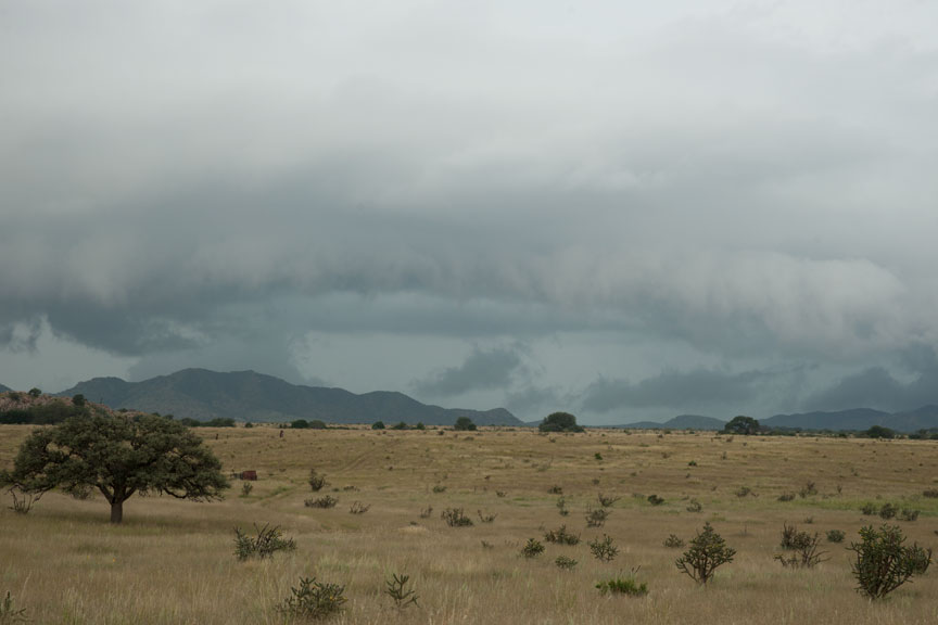
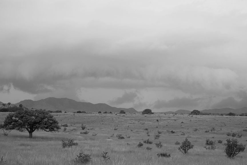
In addition, B&W films were designed to approximate, not what was actually in front of the camera, but what we photographers thought was in front of the camera. That is to say, the gray tones we thought we saw but weren’t really there, are what B&W film manufacturers strove to produce. This fact is no longer hidden from us with digital images, as can be seen in this digital capture, that is simply desaturated (all color removed, but leaving the brightness/gray tone), as many authors recommend:
Straight digital capture, desaturated
And remember that you are viewing this image by the transmitted light of your monitor which is much more contrasty than the reflected light of a print. On paper, this would be dull as dirt! Except for the bright clouds, this image is close to being one continuous, monotonous gray. It is all evenly illuminated by an overcast sky and therefore shows more or less the true light reflectance/gray tones as reflected by the different colors in the scene. Boring!
The reason for this is that colors in nature are seldom pure or anywhere near saturated. The blue of the sky is usually the most saturated color in a scene and that is the reason that the greatest effect of filters was often just to darken the sky. Photographers frequently had only that darkened sky as an option for putting some life into an image. Filters had less effect on the rest of a scene, or an effect different than expected.
In the end, it is amazing just how uniformly gray the world is.
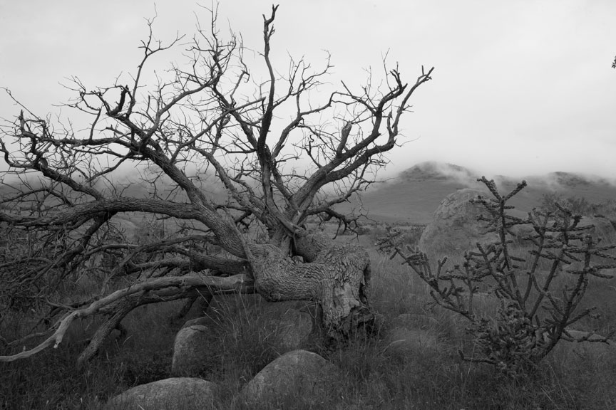
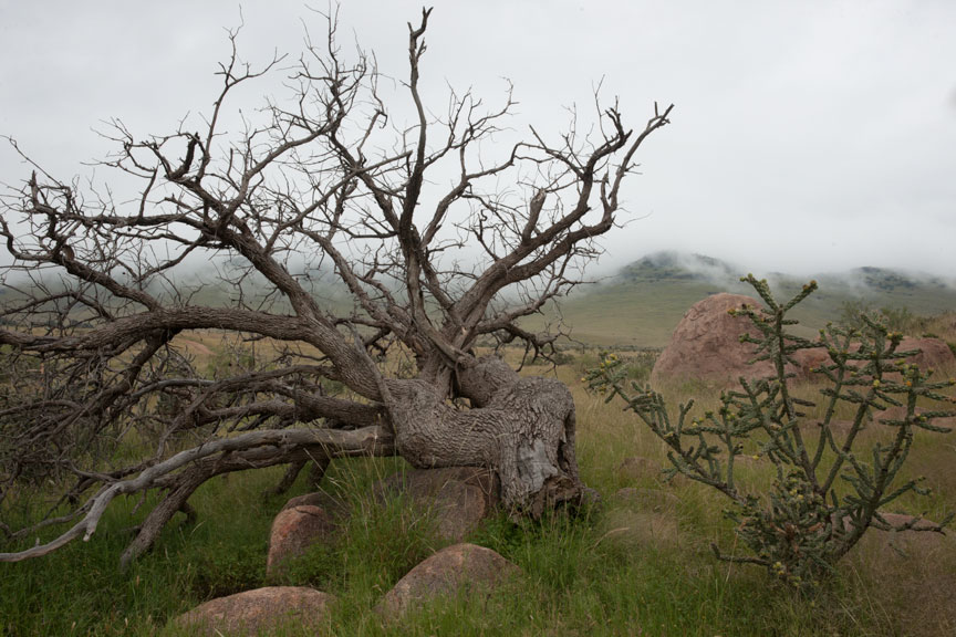
This is why film manufacturers adjusted the color sensitivity of B&W films. To provide a more natural result: or, what the photographer thought was more natural. In reality, the result wasn’t natural at all. Below is the unaltered color original of the gray image shown above. People look at a scene like this and see a lot of color, but there is really very little diffence in gray tone.
Dead Tree & Fog — no alteration at all
There was a fair amount of tone control available with B&W film and paper, especially during the last 30-40 or so years, when people were inventing new techniques left and right. I was responsible for well over a dozen of those new techniques. But digital… WOW! Digital tools make the techniques I invented look like toys by comparison.
Take what you could do with film and multiply that by 20, at least, for digital. But I do have to scratch my head when I read books and articles on B&W photography in the digital age. Most all of them begin with, “Convert your color image to B&W by way of method X, Y or Z”. There is absolutely zero reason to ever convert a color image to B&W by any method, especially if the result you are after is a B&W print. It is the colors in the captured image that allow you to create the B&W result you want. Never throw away the color in your images. If you do, you reduce your B&W options by about 98%.
As you can see from the two images shown above, if you are after a B&W image, in many cases color is most of what you have to work with because there are often not a lot of difference in light reflectance, and Photoshop (and I assume other software as well, but don’t know) has lots of tools for working with color.
In the digital age of photography a lot more can be done to manipulate the colors of an image with the goal of changing the final gray tones, than could ever be done with film and filters. The tools necessary are to be found in Adobe’s Camera Raw and then of course in Photoshop. (If you use other software, you may have some of these tools too.) Both are really necessary for best control.
Described simply, the approach is to saturate the colors so that they are more amenable to manipulation and then darken or lighten those colors. Then more conventional techniques such as the modern equivalents of burning and dodging can be used to further control the result.
As much work should be done in Camera Raw as possible because those tools are non-destructive while the tools in Photoshop are less so. 16 bit images are a must, because extreme manipulation is involved and 8 bit images will simply come unglued before you are even half way there.
The necessary color manipulation tools in Camera Raw are found in the Basic and HSL/Grayscale panels. In Basic there are Vibrance and Saturation sliders. Vibrance increases the saturation of colors that are poorly saturated. Saturation tends to affect colors that started out stronger to begin with. Vibrance is a useful tool and can only be controlled here. Saturation is better controlled on the HSL/Grayscale panel.
On the HSL/Grayscale panel there are three tabs, for Hue (you can change one color to another), Saturation and Luminance (brightness). Hue might be occasionally useful, but Saturation and Luminance are the tools you will need most. The rule here is simple, experiment! Don’t just increase the saturation of all the colors. That can be done with the saturation tool on the Basic panel. Overall saturation increases can run some colors into each other and cause image degradation in those areas in the final B&W image. Besides, you want to be able to control the saturation of colors separately in order to fine tune the gray tones of your images. There are hue and saturation tools in Photoshop, but the best place to do this is here in Camera Raw.
Save the image for further work in Photoshop, always as a Smart Object. This way you can go back to change what you did in Camera Raw as often as you need to, and you will need to on virtually every image.
You will notice on the HSL/Grayscale panel that there is of course, a Convert to Grayscale option. Don’t. Ever! This is the wrong place to do this and limits options considerably. That is too bad, because this feature has the option to control Orange which is very useful and oddly absent in Photoshop. Nonetheless, you lose far more than you gain by using this feature.
Once you have opened the image as a Smart Object in photoshop, you will need two layers right away (always work with layers, never on the image itself). First a Solid Color Fill Layer. Set the blending mode to Color, otherwise you will see just the color layer and not the photograph underneath it. If you want neutral gray tones (more on this another time), set the HSB values to 0, 0, 100. This is always the topmost layer. I am after brown tone prints, so my settings for this layer are: 43, 100, 12 (sometimes 13, depending on the paper I am using), in a ProPhoto RGB color space. Do this even if you are printing with Epson’s Advanced Black and White feature. It helps to see what you are doing.
Between the Solid Color Layer and the Smart Object layer, place a Black & White Adjustment layer. This is where you will alter the gray tones to suit the print you have in mind. If you need to change overall brightness or contrast, double-click the smart object layer to go back into Camera Raw and change those settings there. Also go back into Camera Raw to change saturation and brightness of individual colors to control what you get in Photoshop’s Black & White Adjustment layers.
Note that I did say layers just above and not layer. That is because you can have multiple Black & White Adjustment layers in Photoshop for vastly greater control. In Camera Raw, you are limited to only one Convert to Grayscale control, which by the way, turns off all of the saturation and brightness controls you previously set in the same panel. That makes the Convert to Grayscale feature a complete non-starter and utterly useless. Potentially a great tool, but wrong place and wrong implementation!
Just about done for today, but I should answer that question that popped into your head when reading the previous paragraph…
How can I benefit from multiple Black & White Adjustment layers? Masks. There are basically three digital classes of tools available for constructing a B&W photograph. (And constructing is the appropriate word.) They are:
Color manipulation
Traditional photographic tools: contrast/brightness/burning/dodging but with digital tools (quite different)
Masking
Masking is used to control which areas of an image are affected by any given layer. If you mask out part of the image on a Black & White Adjustment layer, you can use another Black & White Adjustment layer to control the gray tones in the part you masked out in the first layer. Why would you want to do that? Many reasons. An example would be an image that has two areas of the same color, one of which you want darker and the other lighter. More on the topic of masking at another time.
If you are new to the concept of masking in Photoshop, don’t rush out to buy a book on the subject. There isn’t one. The currently available books address masking for B&W images, and fine art photography in particular, little or not at all. They are far more oriented toward masking for commercial photographers. Most of these techniques are useless to fine art photographers. There is only one expert on the subject of masking for fine art photography and he hasn’t written a book. Fortunately, he has done just about everything else you might need. His name is Tony Kuyper and his tools and tutorials are available through his web site.
Tutorials page, with links to purchase the tools (not expensive): http://www.goodlight.us/writing/tutorials.html
His web site (see some of his extraordinary color images): http://www.goodlight.us
And his blog: http://tonykuyper.wordpress.com
While you’re there, don’t forget to nag him about writing a book!
Haven’t been shooting in a while. Taking longer for my leg to heal than I had imagined. Dog bites can be nasty, indeed.
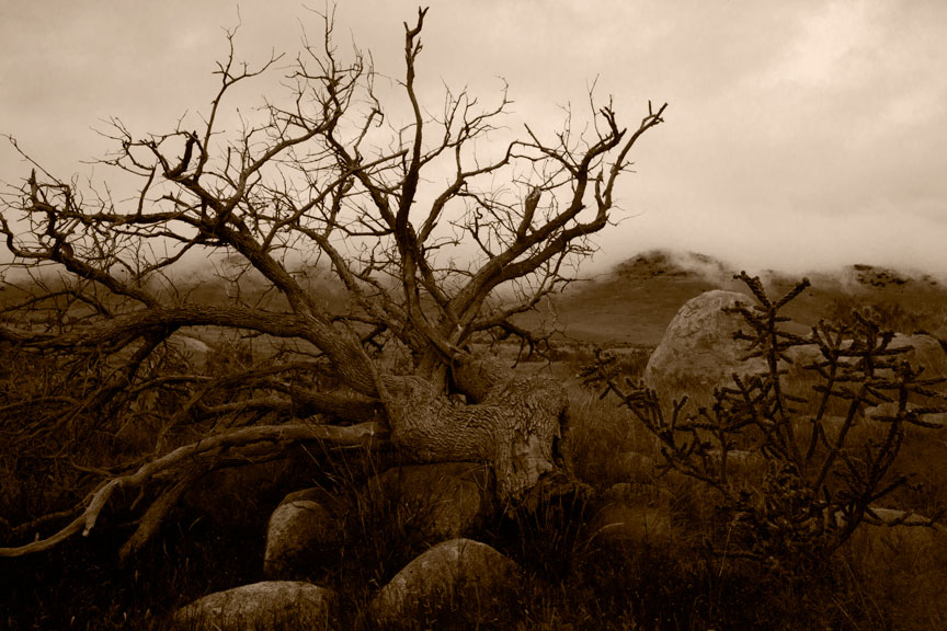
At the moment I am printing “Dead Tree & Fog”, the very first image shot here on the ranch to make it through the process to a final print.
So you don’t have to go hunt for them, here is the original color capture I posted a few days ago:
Dead Tree & Fog — no alteration at all
And here is the preliminary work up I posted that same day.
Dead Tree & Fog (initial work up)
Below is a jpeg of the final image going through the printer now. Of course, always remember the internet does nasty things to photographs and this may actually look significantly darker or lighter on screen than it is in reality. It should also look very brown, as opposed to whatever color you may be seeing.
Dead Tree & Fog
For the technically mired, I am printing this image on Arches Cold Press Watercolor paper (not the cold press Epson sells; Arches paper is not coated for inkjet use). I am using Epson’s inks rather than my B&W set in the other printer because I am about to change that ink set over to a somewhat different grouping of gray inks and that is going to take a while to get set up. The new inks just arrived yesterday. The brown tone is created by setting a solid color fill layer at the very top of my layer stack. With the blending mode set to Color, the layer is set to Hue 43, Saturation 100, Brightness 13. That is in a ProPhoto RGB color space. In regular Adobe RGB I believe those settings come out considerably green. The image underneath the brown tone is still color.
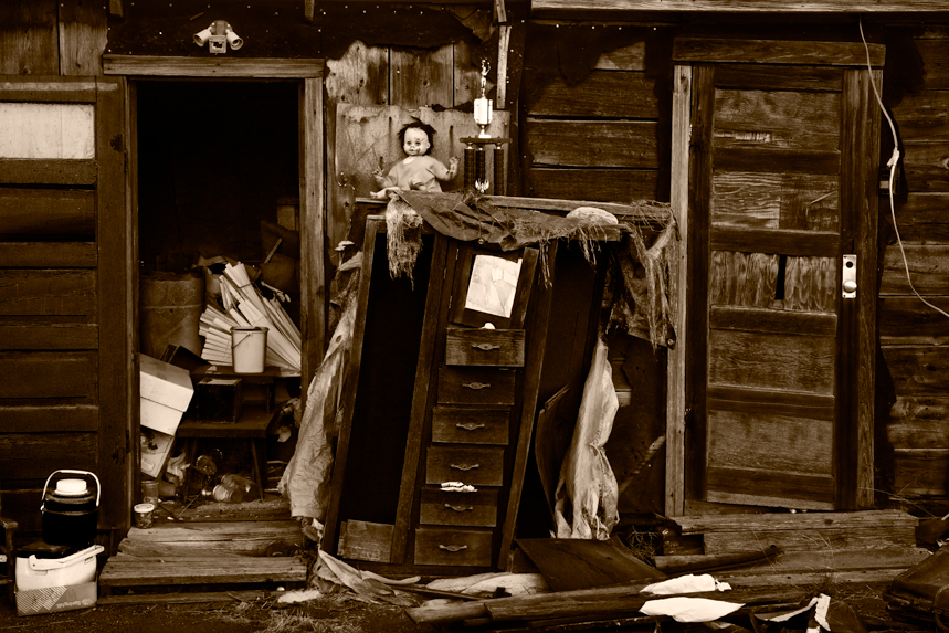
Dead Tree & Fog is one of those images where I don’t know whether people will love it or hate it. Some may call it creepy, as they did Doll & Trophy…
Doll & Trophy, Valentine Texas
I love Doll & Trophy, but it has actually made a number of people recoil in horror. This was all in the back yard of a house in Valentine Texas, about five years ago. The house had been empty/abandoned. I had looked at it many times, but there were signs of activity one day, late in the afternoon. I stopped and walked into the back yard looking for someone to talk to and saw this. I barely got the camera set up on the tripod, got focused and exposed a few frames before the light disappeared. Thought I’d go back the next day to hedge my bet as it were, but all this stuff was already gone. Turns out the town had bought the house and was converting it into a library. All that stuff in the backyard was headed to the dump. I guess no one noticed what a magnificent arrangement of detritus they had made just piling it all up randomly. I promise you, I didn’t move so much as a fiber. (Not averse to clipping a blade of grass, but this was just perfect, exactly as found.)
Church On The Way To Colca (Department of Arequipa, Peru late 1980’s)
In my last post (no excuses, I have had to be away for a while) I started talking about how B&W photography is really color photography. It is the careful translation of colors into gray tones, aided by the use of color filters placed before or behind the lens, at the time of image capture. This was the way it was done for more than a hundred years, but it was far from ideal.
Filters often had a different effect from the one expected and even when they worked as advertised, lots of gray tones in a photograph were not what the photographer wanted. Other techniques, such as dodging and burning, would have to be applied at the time of printing, in order to control the rest of the photograph.
It is necessary to understand that silver-based B&W printing papers were never made with artists in mind. They were made for commercial use and though some were certainly better than others from an artist’s perspective, manufacturer’s rarely considered artists. A paper that lent itself to artistic use usually existed more by accident than design, advertising claims notwithstanding.
I am reminded of Agfa’s decision in the early 80’s to change their Portriga Rapid paper, a favorite among artists. They changed it enough to make it useless to artists. The resulting tidal wave of complaints had no effect on Agfa whatsoever. They viewed Portriga as a commercial paper, not a paper for artists.
There have been many silver-based photographic papers promoted as having been made for artists, but I have always found that claim suspect. So much more could have been done for artists and never was. And shortly after such claims began to appear, everyone else jumped on the bandwagon. Even some of the most horrific, Eastern European communist block papers were repackaged and promoted as having been made for artists.
Controlling the translation of color to gray tones of a photograph after the fact of exposure has always been a desirable goal. If one could somehow apply that colored filter in the darkroom, instead of the camera, mistakes could be corrected and different options tried. This possibility did in fact exist with film. In theory…
Color negative films would have allowed a photographer to take the colors of the scene home and choose how to affect gray tones later, in the darkroom. There was no reason that wider and infinitely alterable control of the gray tones of a B&W print could not have been achieved by using color negative film for image capture and applying filters to that color film in the darkroom when making a B&W print from it. No reason, save one:
No one ever made any decent panchromatic papers with which to print B&W images from a color negative. Standard B&W papers would print a color negative as though it were a blue-sensitive only, B&W negative. The only panchromatic B&W paper ever in existence, to my knowledge, was one made by Kodak. And for artistic use, it was utterly out of the question. It was made on a plastic base, which no self-respecting B&W fine art photographer would consider using. Prints looked like plastic and had very poor archival qualities. For all practical purposes, there were no papers available for this approach, ever, despite the fact there easily could have been.
What silver based materials were never able to deliver, digital capture and printing have now delivered ten-fold. Digital capture is always in color (save those few digital cameras purposely designed to capture only in B&W, an idea I simply cannot fathom, as it removes precisely the giant leap forward that digital capture provided to the B&W artist), so the photographer can take the color scene home and work on the gray tones at leisure and without limitation.
Photoshop (I don’t know about any other software) allows extreme control via its B&W layers and other controls. Instead of applying a single filter, as is the only option with film, different filters can be applied to different areas of an image, or to the entire image. Using masking, one set of filters can be applied to one part of an image and another set to the rest. The options are almost limitless. It is of course, substantially more difficult to do this digitally than with film, but the learning curve is worth it.
Not only is this a wonderful new set of tools, but it has resulted in the most amusing contradiction…
The best way to create a B&W image in the digital age, is to start with color and never convert it to B&W, at all! EVER!
(I think that is what’s called a teaser. More later.)
Cemetery and Bone (Arequipa, Peru, late 1980’s; no, I didn’t put the bone there)
Black & White photography has always fascinated me. I was never interested in working with color, not even for casual photographs. B&W speaks to me. It allows me to see the world in a new way and to transform it into images I believe have something to say.
Practically everyone says they like B&W photographs. But most people don’t get black & white. Most photographers don’t get it. In fact, a lot of photographers who work in B&W don’t get it!
Black and white photography is really about the colors. And how those colors translate into gray tones. Arriving at the gray tones of a B&W photograph is not in any way straightforward or predetermined. It is very widely mutable. And it is, or should be, under the complete control of the photographer.
When photography first came into being, all photographic materials were of course B&W, and all were sensitive only to the blue portion of the visible spectrum. Skies were always washed out and very white in prints, plants and red things were usually very dark. It did not leave a lot of room for interpretation. Anything a photographer might want to alter about the gray tones in an image had to be done by controlling exposure to selected areas when making a print. This was effective, but only to a limited degree.
Orthochromatic films (sensitive to both blue and green) came along in 1873, giving photographers a way to finally control the gray tones in an image at the time of exposing the negative. A yellow or green filter could be placed over the lens and blue objects, such as the sky, would be darkened. This was often far more effective than trying to alter tones at the time of making a print.
Finally, panchromatic films sensitive to blue, green and red light, the full visible spectrum, came along in 1906. Photographers finally had a range of choices at the time of film exposure with regard to how gray tones would be represented in their photographs. By simply placing a colored filter in front of or behind the lens, virtually any color(s) in the scene could be made to come out darker or lighter in the final image. Some photographers carried only one or two filters, some none at all. Others, like myself, would utilize a dozen or more. But only one filter could be used per negative and the results were only moderately predictable. Surprises were very common and whatever guess a photographer made at the time of exposure was a guess he was permanently stuck with. In addition, one had to alter both exposure of the negative and its development, to compensate for the fact that filters changed more than just some of the gray tones.
From the very beginning, B&W photography was heavily dependent on the manipulation of the way colors affected the exposure of various portions of a negative.
More on this subject in an upcoming post.
As for my day to day work. Yesterday I didn’t even remove the camera from the car. I went out, saw nothing. It was very bleak, rainy and hazy all day. This morning was quite similar, but I did use the camera a couple of times. This one looks potentially interesting:
No Title (saturated color only)No Title (preliminary workup)
Just got back from an hour or so of working this evening. One thing looks promising. Also worked a couple of hours this morning, but that all looks like junk.
Of course, unless an image is unusable because it is technically flawed, such as being out of focus, or severely underexposed, I tend to hang on to them, just in case. Anything that looks good, even if badly damaged, I keep. More than once I have been going through images rejected years ago and found something good enough to make me puzzle why on Earth I rejected it in the first place.
I kept a whole project of 35mm street photography for 30+ years, knowing all the negatives were too severely damaged to be printable. Then Photoshop made them repairable and now I have a bunch a great images I never thought possible.
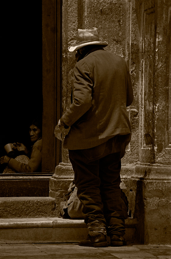
Here’s another of those images.
At The Church Door
On the about page I mention that my work, as far as capture is concerned, is now all digital. I started making the changeover about seven years ago. It was not an easy transition. Digital capture is better in some ways and not so much in others. It’s like any other improvement in technology. You get some things and give up others.
Film had much higher resolution than digital capture has now, or is likely to have for another several years at least. If you compare a well-made print from medium or large format film to the digital counterpart, there is much more detail in the film image. However, I am speaking of nose pressed against glass comparison, which is of course, not the way to view fine art photographs. At reasonable viewing distances, it is difficult or impossible to tell there is a difference and digital images are adequate to the task, assuming a large sensor, tripod, careful procedure, etc. I would prefer higher resolution, but can live with what I am getting.
One very surprising defect, so to speak, with digital is that because the capture is in color and images are always purposely on the brink of overexposure (to get maximum information in the capture), there is not a lot of similarity between the RAW digital image on the screen and what I saw in my minds eye when I decided to take the photograph. Often I have to go back to an image a few times before I remember what I had in mind when I took it, or even apply manipulation to it in Photoshop to see if it jogs my memory. The unchanged digital capture usually looks pretty pathetic on the screen.
B&W film captures printed onto contact sheets were always much closer to what I intended because, well, they were B&W(!) and they were already partially manipulated tonally via use of colored filters for B&W, and they were exposed and developed for making the kind of print I had in mind. A quick look at a contact print made me instantly remember what I wanted when I shot the image. I miss that easy recognition.
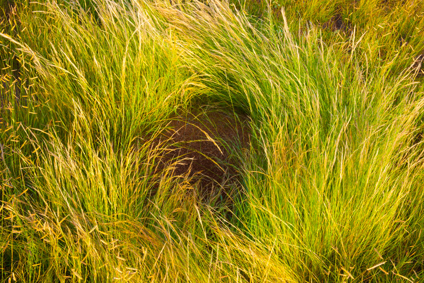
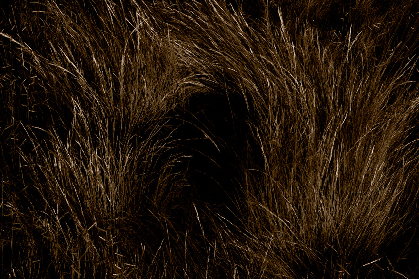
Anyway, here’s some of the take from this morning. First, the captured image, heavily saturated but otherwise, untouched. Then a preliminary workup in B&W.
Grass Swirl (heavily saturated)Grass Swirl
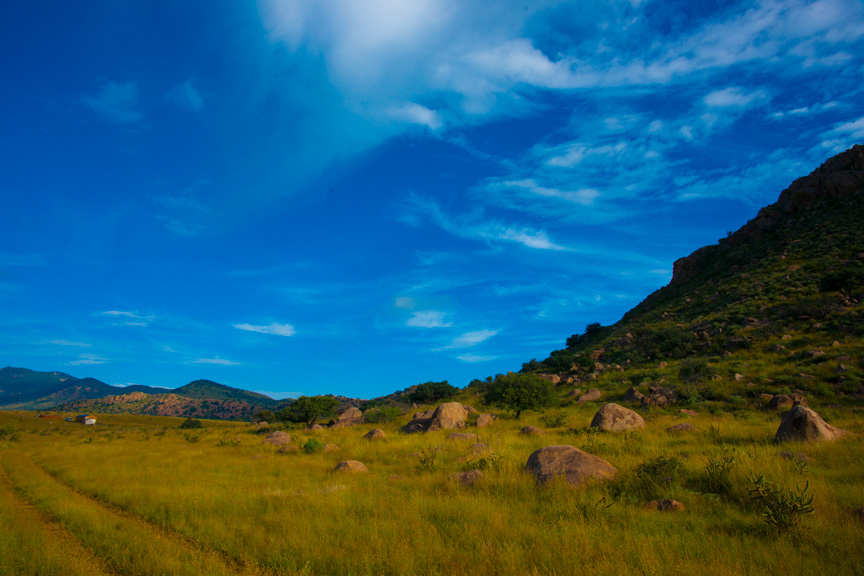
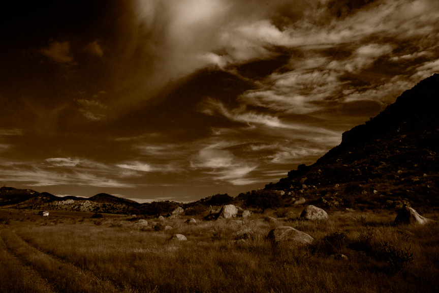
Rear of Small Ranch House (heavily saturated)Rear Small Ranch House
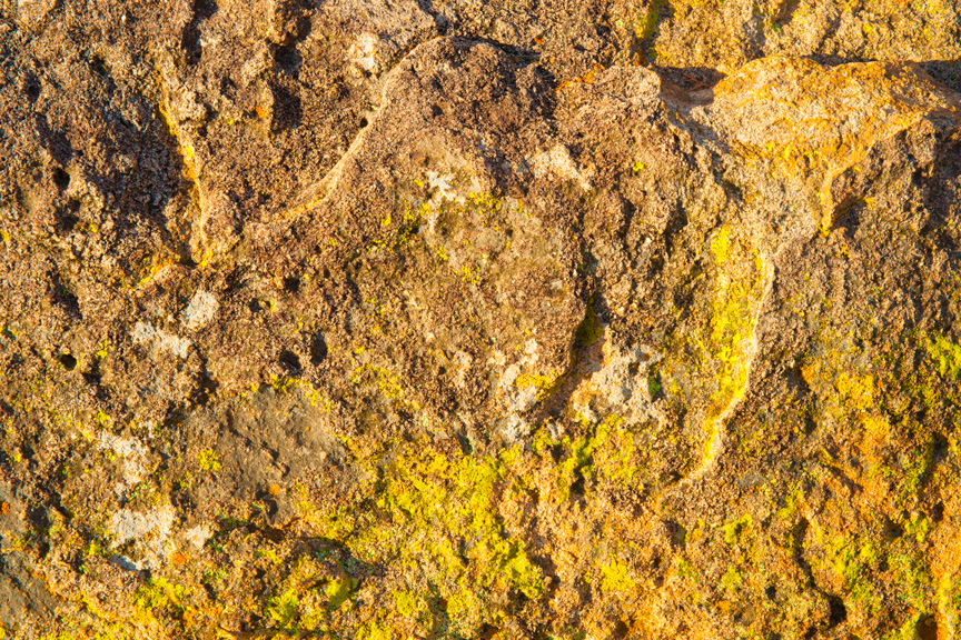
Rock Abstract (heavily saturated)Rock Abstract
The grass swirl and rock abstract look moderately promising. The ranch house image is definitely headed for the scrap heap. The clouds are kind of interesting, but the rest of the image was pretty badly seen. Sometimes, in fact often, you find a great piece of an image, but nothing else to support it.
I am reminded of a quote from Alan Ross, one of Ansel Adams’ former assistants. “When I first went to work as Ansel’s assistant, one of the things that struck me the most was the realization, while going through boxes and boxes of his work, that he had made an awful lot of very ordinary photographs! I was somewhat stunned to learn that he had no illusions and no expectations that every film he exposed would wind up being another one of what he fondly called his Mona Lisas.”
Fine art photography is ten percent image capture, ten percent distinguishing a potentially great image and 80 percent being able to print that image masterfully. A lot of people think the lab makes the prints for fine art photographers. That is not remotely the case. Though a few fine art photographers do employ others to make their prints, the people employed are artists themselves and not available or even known, to the general public.
To paraphrase Ansel Adams’ musical metaphor, the captured image is simply a visual score. It is not art and a simple, literal translation of that captured image to paper is also not art. The performance of that score, the real art, is in making the print. No one goes to a concert to applaud the sheet music.
Here is a very preliminary work up of an image I captured this evening. This may have promise.
Split Rock
More tomorrow. (Leg feeling better, so I am more inclined to work.)