Dead Tree & Fog, First Final Print


Haven’t been shooting in a while. Taking longer for my leg to heal than I had imagined. Dog bites can be nasty, indeed.

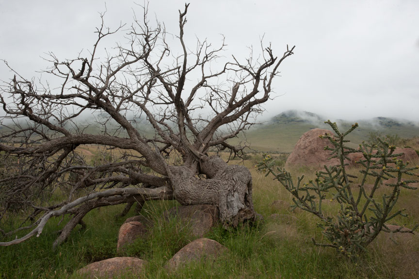
At the moment I am printing “Dead Tree & Fog”, the very first image shot here on the ranch to make it through the process to a final print.

So you don’t have to go hunt for them, here is the original color capture I posted a few days ago:

Dead Tree & Fog — no alteration at all

And here is the preliminary work up I posted that same day.

Dead Tree & Fog (these are never final titles; I just need to be able to recognize which image it is)
Dead Tree & Fog (initial work up)

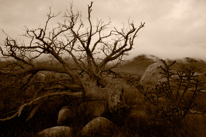
Below is a jpeg of the final image going through the printer now.  Of course, always remember the internet does nasty things to photographs and this may actually look significantly darker or lighter on screen than it is in reality. It should also look very brown, as opposed to whatever color you may be seeing.

DeadTreeAndFog2014-9-12_DSC1421_MASTER_SO
Dead Tree & Fog

For the technically mired, I am printing this image on Arches Cold Press Watercolor paper (not the cold press Epson sells; Arches paper is not coated for inkjet use). I am using Epson’s inks rather than my B&W set in the other printer because I am about to change that ink set over to a somewhat different grouping of gray inks and that is going to take a while to get set up. The new inks just arrived yesterday. The brown tone is created by setting a solid color fill layer at the very top of my layer stack. With the blending mode set to Color, the layer is set to Hue 43, Saturation 100, Brightness 13. That is in a ProPhoto RGB color space. In regular Adobe RGB I believe those settings come out considerably green. The image underneath the brown tone is still color.

Dead Tree & Fog is one of those images where I don’t know whether people will love it or hate it. Some may call it creepy, as they did Doll & Trophy…

Doll & Trophy, Valentine Texas

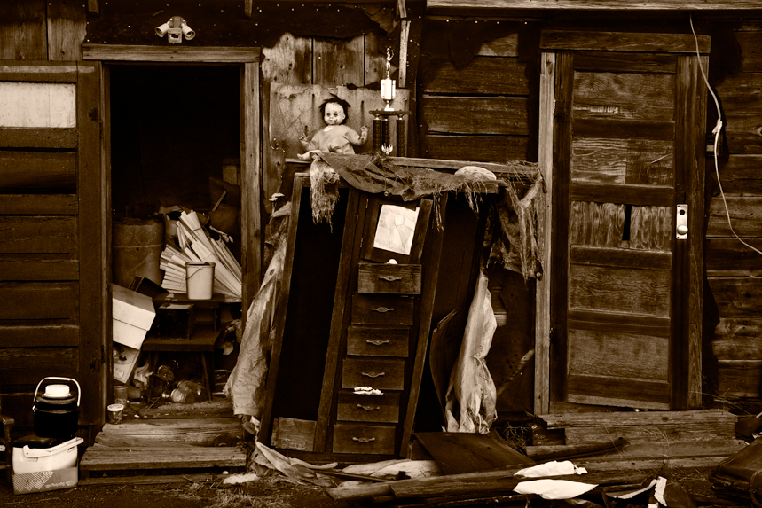
I love Doll & Trophy, but it has actually made a number of people recoil in horror. This was all in the back yard of a house in Valentine Texas, about five years ago. The house had been empty/abandoned. I had looked at it many times, but there were signs of activity one day, late in the afternoon. I stopped and walked into the back yard looking for someone to talk to and saw this. I barely got the camera set up on the tripod, got focused and exposed a few frames before the light disappeared. Thought I’d go back the next day to hedge my bet as it were, but all this stuff was already gone. Turns out the town had bought the house and was converting it into a library. All that stuff in the backyard was headed to the dump. I guess no one noticed what a magnificent arrangement of detritus they had made just piling it all up randomly. I promise you, I didn’t move so much as a fiber. (Not averse to clipping a blade of grass, but this was just perfect, exactly as found.)

URL Address Change

Just a brief announcement…

I intended to do this sooner but technical difficulties prevented it, and even prevented me from accessing my own blog for a brief period.

If you have accessed this blog before today, you did so via the URL www.davidkachel.com/wp/

As of now the URL has been changed to what it was originally intended to be:

www.thetransparentphotographer.com

I hope this will not have inconvenienced anyone, but I am sure it will.

Black & White Is Really Color, cont’d


Church On The Way To Colca
Church On The Way To Colca (Department of Arequipa, Peru late 1980’s)

In my last post (no excuses, I have had to be away for a while) I started talking about how B&W photography is really color photography. It is the careful translation of colors into gray tones, aided by the use of color filters placed before or behind the lens, at the time of image capture. This was the way it was done for more than a hundred years, but it was far from ideal.

Filters often had a different effect from the one expected and even when they worked as advertised, lots of gray tones in a photograph were not what the photographer wanted. Other techniques, such as dodging and burning, would have to be applied at the time of printing, in order to control the rest of the photograph.

It is necessary to understand that silver-based B&W printing papers were never made with artists in mind. They were made for commercial use and though some were certainly better than others from an artist’s perspective, manufacturer’s rarely considered artists. A paper that lent itself to artistic use usually existed more by accident than design, advertising claims notwithstanding.

I am reminded of Agfa’s decision in the early 80’s to change their Portriga Rapid paper, a favorite among artists. They changed it enough to make it useless to artists. The resulting tidal wave of complaints had no effect on Agfa whatsoever. They viewed Portriga as a commercial paper, not a paper for artists.

There have been many silver-based photographic papers promoted as having been made for artists, but I have always found that claim suspect. So much more could have been done for artists and never was. And shortly after such claims began to appear, everyone else jumped on the bandwagon. Even some of the most horrific, Eastern European communist block papers were repackaged and promoted as having been made for artists.

Controlling the translation of color to gray tones of a photograph after the fact of exposure has always been a desirable goal. If one could somehow apply that colored filter in the darkroom, instead of the camera, mistakes could be corrected and different options tried. This possibility did in fact exist with film. In theory…

Color negative films would have allowed a photographer to take the colors of the scene home and choose how to affect gray tones later, in the darkroom. There was no reason that wider and infinitely alterable control of the gray tones of a B&W print could not have been achieved by using color negative film for image capture and applying filters to that color film in the darkroom when making a B&W print from it. No reason, save one:

No one ever made any decent panchromatic papers with which to print B&W images from a color negative. Standard B&W papers would print a color negative as though it were a blue-sensitive only, B&W negative. The only panchromatic B&W paper ever in existence, to my knowledge, was one made by Kodak. And for artistic use, it was utterly out of the question. It was made on a plastic base, which no self-respecting B&W fine art photographer would consider using. Prints looked like plastic and had very poor archival qualities. For all practical purposes, there were no papers available for this approach, ever, despite the fact there easily could have been.

What silver based materials were never able to deliver, digital capture and printing have now delivered ten-fold. Digital capture is always in color (save those few digital cameras purposely designed to capture only in B&W, an idea I simply cannot fathom, as it removes precisely the giant leap forward that digital capture provided to the B&W artist), so the photographer can take the color scene home and work on the gray tones at leisure and without limitation.

Photoshop (I don’t know about any other software) allows extreme control via its B&W layers and other controls. Instead of applying a single filter, as is the only option with film, different filters can be applied to different areas of an image, or to the entire image. Using masking, one set of filters can be applied to one part of an image and another set to the rest. The options are almost limitless. It is of course, substantially more difficult to do this digitally than with film, but the learning curve is worth it.

Not only is this a wonderful new set of tools, but it has resulted in the most amusing contradiction…

The best way to create a B&W image in the digital age, is to start with color and never convert it to B&W, at all! EVER!

(I think that is what’s called a teaser. More later.)