Black & White Is Really Color!


Cemetery and Bone
Cemetery and Bone (Arequipa, Peru, late 1980’s; no, I didn’t put the bone there)

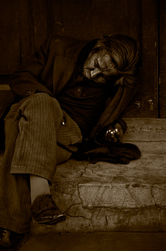
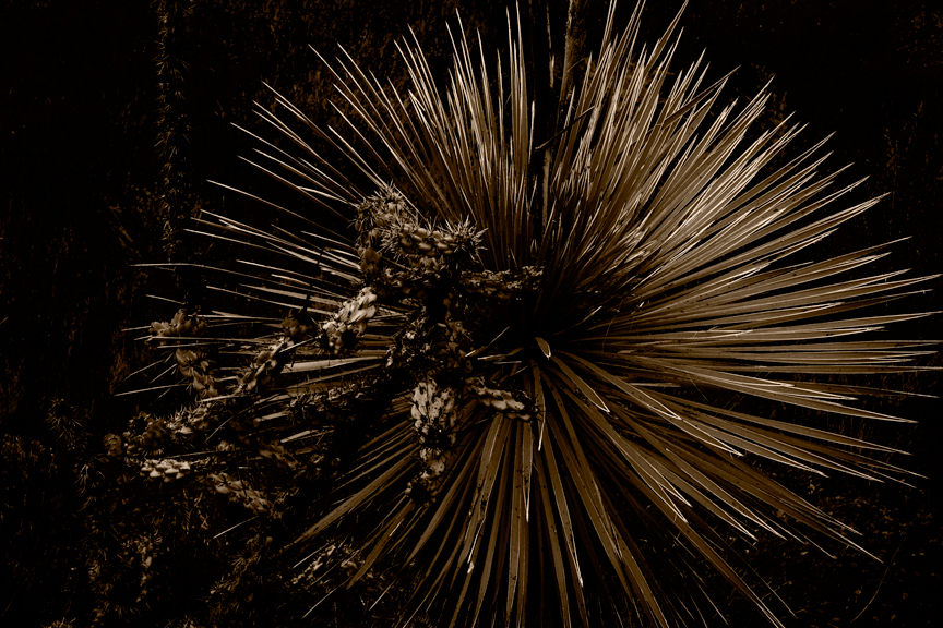
Black & White photography has always fascinated me. I was never interested in working with color, not even for casual photographs. B&W speaks to me. It allows me to see the world in a new way and to transform it into images I believe have something to say.

Practically everyone says they like B&W photographs. But most people don’t get black & white. Most photographers don’t get it. In fact, a lot of photographers who work in B&W don’t get it!

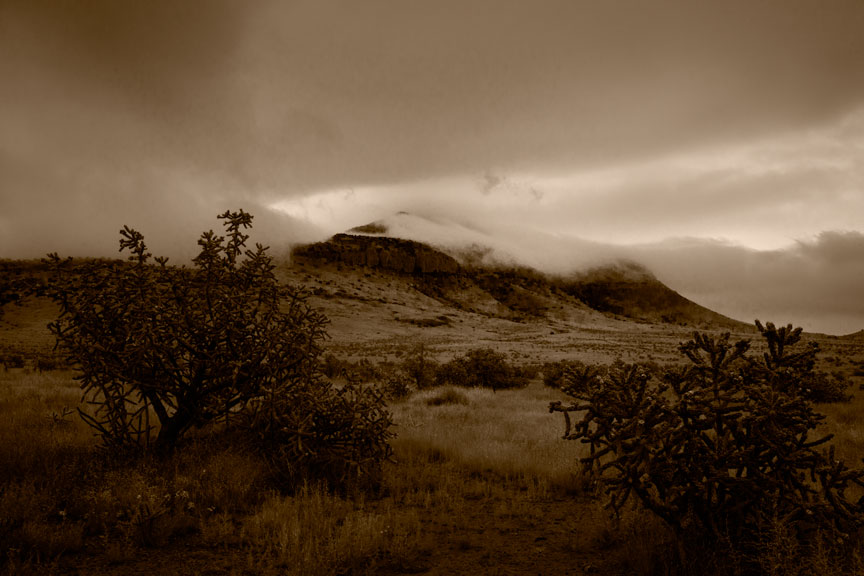
Black and white photography is really about the colors. And how those colors translate into gray tones. Arriving at the gray tones of a B&W photograph is not in any way straightforward or predetermined. It is very widely mutable. And it is, or should be, under the complete control of the photographer.

When photography first came into being, all photographic materials were of course B&W, and all were sensitive only to the blue portion of the visible spectrum. Skies were always washed out and very white in prints, plants and red things were usually very dark. It did not leave a lot of room for interpretation. Anything a photographer might want to alter about the gray tones in an image had to be done by controlling exposure to selected areas when making a print. This was effective, but only to a limited degree.

Orthochromatic films (sensitive to both blue and green) came along in 1873, giving photographers a way to finally control the gray tones in an image at the time of exposing the negative. A yellow or green filter could be placed over the lens and blue objects, such as the sky, would be darkened. This was often far more effective than trying to alter tones at the time of making a print.

Finally, panchromatic films sensitive to blue, green and red light, the full visible spectrum, came along in 1906. Photographers finally had a range of choices at the time of film exposure with regard to how gray tones would be represented in their photographs. By simply placing a colored filter in front of or behind the lens, virtually any color(s) in the scene could be made to come out darker or lighter in the final image. Some photographers carried only one or two filters, some none at all. Others, like myself, would utilize a dozen or more. But only one filter could be used per negative and the results were only moderately predictable. Surprises were very common and whatever guess a photographer made at the time of exposure was a guess he was permanently stuck with. In addition, one had to alter both exposure of the negative and its development, to compensate for the fact that filters changed more than just some of the gray tones.

From the very beginning, B&W photography was heavily dependent on the manipulation of the way colors affected the exposure of various portions of a negative.

More on this subject in an upcoming post.

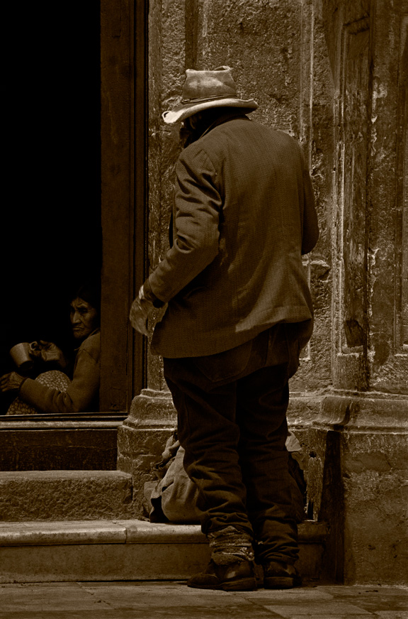
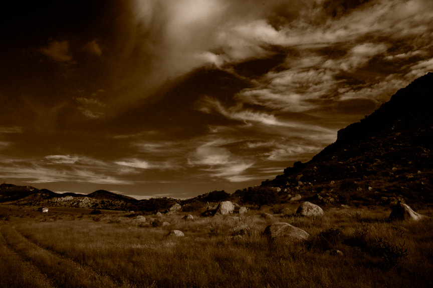
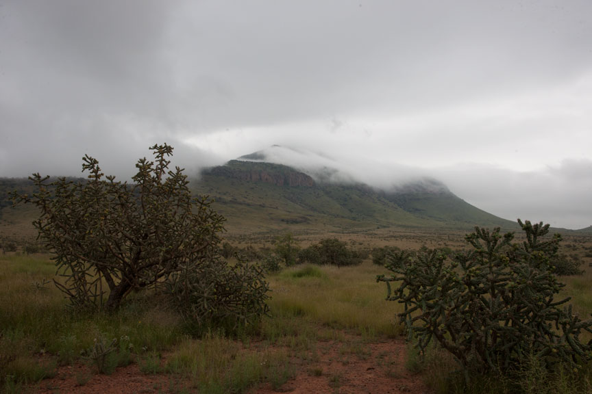
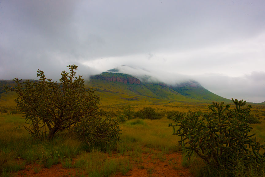
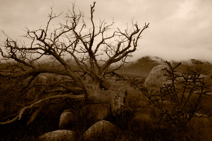
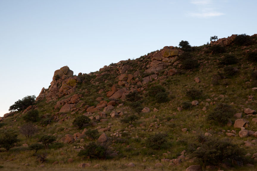
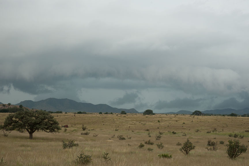
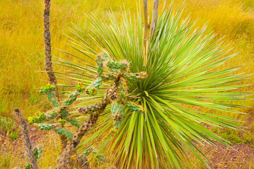
As for my day to day work. Yesterday I didn’t even remove the camera from the car. I went out, saw nothing. It was very bleak, rainy and hazy all day. This morning was quite similar, but I did use the camera a couple of times. This one looks potentially interesting:


No Title (saturated color only)
No Title
No Title (preliminary workup)

dk

Some OK, Some Better


Just got back from an hour or so of working this evening. One thing looks promising. Also worked a couple of hours this morning, but that all looks like junk.

Of course, unless an image is unusable because it is technically flawed, such as being out of focus, or severely underexposed, I tend to hang on to them, just in case. Anything that looks good, even if badly damaged, I keep. More than once I have been going through images rejected years ago and found something good enough to make me puzzle why on Earth I rejected it in the first place.

I kept a whole project of 35mm street photography for 30+ years, knowing all the negatives were too severely damaged to be printable. Then Photoshop made them repairable and now I have a bunch a great images I never thought possible.

Here’s another of those images.

At The Church Door
At The Church Door

On the about page I mention that my work, as far as capture is concerned, is now all digital. I started making the changeover about seven years ago. It was not an easy transition. Digital capture is better in some ways and not so much in others. It’s like any other improvement in technology. You get some things and give up others.

Film had much higher resolution than digital capture has now, or is likely to have for another several years at least. If you compare a well-made print from medium or large format film to the digital counterpart, there is much more detail in the film image. However, I am speaking of nose pressed against glass comparison, which is of course, not the way to view fine art photographs. At reasonable viewing distances, it is difficult or impossible to tell there is a difference and digital images are adequate to the task, assuming a large sensor, tripod, careful procedure, etc. I would prefer higher resolution, but can live with what I am getting.

One very surprising defect, so to speak, with digital is that because the capture is in color and images are always purposely on the brink of overexposure (to get maximum information in the capture), there is not a lot of similarity between the RAW digital image on the screen and what I saw in my minds eye when I decided to take the photograph. Often I have to go back to an image a few times before I remember what I had in mind when I took it, or even apply manipulation to it in Photoshop to see if it jogs my memory. The unchanged digital capture usually looks pretty pathetic on the screen.

B&W film captures printed onto contact sheets were always much closer to what I intended because, well, they were B&W(!) and they were already partially manipulated tonally via use of colored filters for B&W, and they were exposed and developed for making the kind of print I had in mind. A quick look at a contact print made me instantly remember what I wanted when I shot the image. I miss that easy recognition.

Anyway, here’s some of the take from this morning. First, the captured image, heavily saturated but otherwise, untouched. Then a preliminary workup in B&W.

Grass Swirl  (heavily saturated)
Grass Swirl (heavily saturated)
Grass Swirl
Grass Swirl


Rear of Small Ranch House  (heavily saturated)
Rear of Small Ranch House (heavily saturated)
Rear Small Ranch House


Rock Abstract  (heavily saturated)
Rock Abstract (heavily saturated)
Rock Abstract
Rock Abstract

The grass swirl and rock abstract look moderately promising. The ranch house image is definitely headed for the scrap heap. The clouds are kind of interesting, but the rest of the image was pretty badly seen. Sometimes, in fact often, you find a great piece of an image, but nothing else to support it.

I am reminded of a quote from Alan Ross, one of Ansel Adams’ former assistants. “When I first went to work as Ansel’s assistant, one of the things that struck me the most was the realization, while going through boxes and boxes of his work, that he had made an awful lot of very ordinary photographs! I was somewhat stunned to learn that he had no illusions and no expectations that every film he exposed would wind up being another one of what he fondly called his Mona Lisas.”

Fine art photography is ten percent image capture, ten percent distinguishing a potentially great image and 80 percent being able to print that image masterfully. A lot of people think the lab makes the prints for fine art photographers. That is not remotely the case. Though a few fine art photographers do employ others to make their prints, the people employed are artists themselves and not available or even known, to the general public.

To paraphrase Ansel Adams’ musical metaphor, the captured image is simply a visual score. It is not art and a simple, literal translation of that captured image to paper is also not art. The performance of that score, the real art, is in making the print. No one goes to a concert to applaud the sheet music.

Here is a very preliminary work up of an image I captured this evening. This may have promise.

Split Rock
Split Rock

More tomorrow. (Leg feeling better, so I am more inclined to work.)

Tissue Photogravure At last!

Today is a day I have waited for 30 years. I just now pulled my very first photogravure on Japanese tissue paper.
The image below was shot on the streets of Peru in the early 80’s. The only period during which I ever worked with a handheld 35mm camera. This is of course a jpeg made in photoshop and not a photogravure, the subtleties of which would not remotely carry over to a web image. And besides, it would involve photographing a photograph; a pretty silly pursuit.
Passed Out
Passed Out
It worked and it looked good. Of course, with some experience it will look even better; I hope! At last, I can get precisely what I want out of a print. It has been a very long time coming.
Just a little background…
I became interested in photogravure about 30+ years ago. At the time it was my privilege to handle some of Edward S. Curtis’ largest original photogravure prints made on Japanese tissue paper. (This is a bullet proof art paper that looks like nothing else on Earth.) The tissue print versions of his work are the rarest and most sought after.
Photogravure is one of the three printing processes for photographs considered to be among  the most beautiful and stable. They are:
  • Platinum/Palladium
  • Carbon
  • Photogravure

Photogravure is the most difficult and until now, the most expensive. In recent years various advances have been made that have resulted in the process becoming less expensive and a bit easier.

In August of 2013, I learned of a new approach for getting the image onto a plate for the purpose of exposing the plate, that was the last major key to making the whole thing practical and within reason from the standpoint of cost. It took several months to put the equipment together and start experimenting. The new process wasn’t entirely usable so I spent some of those months working on those wrinkles, with success.

Previously I had printed a number of test images on cotton rag printmaking papers, but not on Japanese tissue, the original goal. Just before the move to Fort Davis I purchased a couple different types of tissue in roll form for testing, from Hiromi Paper in California, but the move caused that testing to be put off until today.

There is a long tradition in fine art photography of printing photogravures on Japanese tissue. It started with Alfred Stieglitz and the gravures he tipped into his famous magazine Camera Work, and reached its zenith with the monumental and extraordinary work of Edward S. Curtis. Gravure has experienced a renewed interest in recent years but still has not approached the strength of its heyday. This new approach may lead to a long overdue revival.

More on this in coming days.

BTW, I have not posted the last couple of days because I lost an altercation with a friend’s dog on Saturday and am busy licking my wounds. The dog is in a corner somewhere, snickering! It’s true what they say: those jaws can really crush tissue! I have a calf with some funny angles to it that didn’t used to be there.

Muttley snickering
Muttley snickering

Better Day, Blue Mountain


Yesterday was a complete loss. This morning was much better. I woke up to find Blue Mountain bathed in fog and immediately saw opportunity. Threw camera and dog into the car and took off across the pastures. Stayed out about three hours, running from spot to spot. Actually, I drive. Wendy runs like she thinks it is her last chance in life. This morning I looked up to see her as a speck on the horizon. No fear in that dog. No brains either, but no fear.

Eventually everything turned the same dull gray and I went home for a second cup of coffee. I’m writing this at 4 in the afternoon. Still looks dull outside. Maybe later.

This is the Blue Mountain Image I decided to work with…

Blue Mountain as it came from the camera

Oversaturated image below helps with controlling B&W tones.

Blue Mountain after increasing saturation


Blue Mountain — working image — this will probably turn out well

Below is one of the images I shot mid-morning after some initial modifications. It is far from finished, but will give you the idea of where I am headed with it.

Dead Tree & Fog (these are never final titles; I just need to be able to recognize which image it is)

Here’s that same image as it came from the camera.

Dead Tree & Fog — no alteration at all

Here it is again, after increasing color saturation in advance of manipulating the gray tones. Oversaturated color photographs are in very bad taste, but as a tool for B&W, saturation is very helpful.

Same again — very saturated color

That makes two images in one day that look like they may work out. That’s very good. Usually, it is one or none. Of course, living in the middle of my work may up my percentages a bit. We’ll see.

I’m hoping to go out again in a little while, but it is getting quite windy.

Everybody Has To Go to Work


A beautiful morning today. Very still air. Very slightly cool requiring just a T-shirt. Sky still very orange near the sun, with long thin clouds just above the horizon. Everything very soft. I did not feel inspired to go photograph (everybody has to go to work, inspired or not) but I couldn’t face sitting in a dark office on so beautiful a morning, either.

My office is dark because it is in the center of the house. In fact, at one time my office pretty much was the house. Built in 1850 (not a typo) this house is very solid with adobe walls a foot and a half thick, so as to resist attack. And I don’t mean Mormon missionaries!

There are six doors in my quite large office and one small window which I have blacked out so that I can work with UV sensitive materials. Someone started installing track lighting at one time, but didn’t get past the first strip, so the room is funeral home dark without extra lighting and even then, it is problematic. Only moved in two months ago, so eventually will get around to adding better lighting. The house has been greatly expanded over the years and is now quite large. With 12 foot ceilings and plenty of windows in all the other rooms, it feels quite open and spacious. Except for a seriously leaky roof in a couple of rooms (being worked on), this is really a wonderful old house, worthy of a movie.

Anyway…

I put my camera case (actually a fishing tackle box; those seldom get stolen) in the car so as to have an excuse to go have my coffee out in one of the pastures. My assistant Wendy jumped in and we went to work. I realized right away that I would need some establishing pictures, so readers might have an idea what the ranch looks like and what kind of landscape I have to work with. These will all be handheld snapshots intended only for this purpose and I will freely manipulate them to make them more visually pleasing for the blog. Only with photographs I intend as serious work will I post an image exactly as it came out of the camera, without improvements.

Wendy looking for best position for a tripod.
Wendy looking for best position for a tripod. These are always found in front of the camera.

The above view is from a position standing between two hills, looking SE. Most of the hills on the ranch have no names, but the one visible on the left is locally called Lizard Mountain. I don’t think it actually has any sort of recorded name. At the base of Lizard Mountain on the far right, just out of sight behind that little end that sticks up, is my house. To the left, out of the frame is Blue Mountain. That name is official and it is well known locally.

When I turn 180 degrees to look behind me, on the left is the only other hill with a name: Teepee. From one perspective it is sort of triangular.

SouthEndTeepeeLookingWest
South End of Teepee, looking West… Note the rock outcropping on the left side with a rather large hawk on top, looking for breakfast


North End of Teepee Looking West


Still standing, sort of, 180 degrees from the photograph where Wendy is helping. Turning to the opposite side, the North end of the other hill, which has no name, is below.

North End of Hill Opposite Teepee

So, to further orient the reader. There are two pairs of hills, one to the South and one to the North. My route this morning was between both pairs. From Lizard Mountain, northward to Teepee.

As I made the images above, as I said, to give you an idea of the terrain, I also put the camera on a tripod two or three times to make more serious images. They failed miserably. Such is life. Sometimes when uninspired I get good things anyway. Not the case this morning.

Storm clouds starting to form. Maybe something interesting will happen.

I went back out in the afternoon, after posting all of the above. Thought I had something better. I did. It was a better class of boring.

Bland, boring
Bland, boring
Better, but still doesn't make me want to use up ink and paper
Better, but still doesn’t make me want to use up ink and paper, maybe another day


Some days you eat the bear. Some days the bear eats you.
Maybe a better day tomorrow.

It All Starts Right Here


First things first. This blog is about the daily doings of a fine art photographer, myself. (I prefer the term artist-photographer) More specifically, it is about how such photographs are made, on the ground, so to speak, at the experiential level. Not the technology necessarily, but the actual experience. Most fine art photographers show only their successes. Here I plan to show everything I can, from where a photograph starts out, to the captured image as it comes raw out of the camera:

Rainbow-LargentRanch_COLOR

through some or all of the progress from capture to final print.

Rainbow-LargentRanch

In this case, the B&W image is not finished. It is just a preliminary workup. I will show images like this one that I am still experimenting with and may never produce as a final print, offered for sale.

My name is David Kachel. I am an artist-photographer working mostly in semi-abstract, always black and white landscape and I live in deepest, darkest West Texas. Until a couple months ago, that was Alpine, population generously estimated at 6500, about 85 miles from Big Bend National Park and nearly 200 miles from the big city, which ain’t very big at all. In Alpine I owned the Red Door Gallery for four years, where I sold my own work exclusively. It was too small to include the work of others. And you would be amazed at how difficult it is to talk good artists into putting their work in a gallery.

On July 1st of this year (2014) I closed that gallery and moved to a cattle ranch about 12 miles southwest of Fort Davis Texas, which is itself 24 miles West of Alpine. The population of Fort Davis is something around 1000 people. The whole county, a fairly large one, has a population of only 2300. The ranch where I am now living has a population of about a dozen or so. There are more isolated places than this in the continental US, but not many.

What I have gained by moving here is something I have never enjoyed before: the ability to step out my door and begin photographing without the expense of travel. I live smack in the middle of some of the most beautiful landscape in America and for the first time in my life, I can work every single day if I want to, without having to consider selling a kidney.

The above photograph(s) is an excellent example. I just wanted a quick snapshot of this unusual occurrence, but out of habit used my serious camera and a tripod. Only later did I realize I might have something more than just a snapshot. This was taken just a few steps outside my front gate. In fact, I expect I will be able to take several very nice images within walking distance of my house. I already have one or two others. Then there’s the rest of the ranch, which offers a whole lot more.

So come along. Share every success and failure, every rattlesnake I step on, every pile of cow dung I step in and every other adventure. Find out what its really like to make fine art photographs full time.

What I will not be doing very much of, is talking about equipment, film, photoshop, lenses, or any of the usual things found on photography blogs. I have already put most of that information on a single page: Equipment & Materials

There is too much of that kind of stuff already and photography isn’t really about any of that. I may occasionally mention a tool I find essential for my work, or an interesting new approach, but that is about all.