I have mentioned Tony Kuyper, his photographs and his very useful tools for photographers, in a couple of previous posts here and here, privately suggested to Tony a few days ago that we should consider doing an interview for this blog.
Just today I learned that the photocascadia web site beat me to the punch. Well, you snooze you lose. Maybe I can come up with enough good questions they didn’t already ask, to justify an interview later on.
Anyway, the interview is a good read and shows some of Tony’s photographs. Don’t miss it:
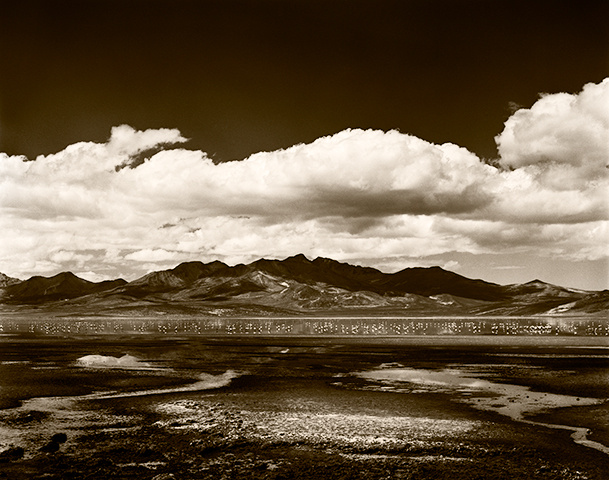
Captured in Arequipa, Peru in the late 1980’s (those tiny little forms on the water are pink flamingoes), Laguna Salinas is actually more of a lake, than a lagoon. It is also quite heavily loaded with salt (hence: salinas) and brine shrimp, where the flamingoes get their coloration.
Laguna Salinas I
Now, back to our regularly scheduled programming…
The Fascinating History of Pictorialism
I must admit I have always had a soft spot for the pictorialists. In particular, I like the early work of Stieglitz and friends. I have no desire to do that kind of work myself, being a so-called straight photographer, but I liked a lot of their work, nonetheless. Platinum prints, in particular are extraordinarily beautiful.
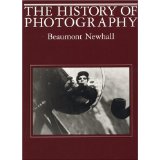
If you read non-technical photography books at all, you probably have the same impression most everyone else does: that the pictorialists dried up and blew away forever when Stieglitz decided to go straight, so to speak, well before the start of World War I. In fact, in his book The History of Photography, author Beaumont Newhall makes little mention of the pictorialists after about 1921.
The History of Photography: From 1839 to the Present
Other historical photographic tomes written by non-pictorialists give them even shorter shrift. In reality, the pictorialist movement lasted until the mid-1950s and for decades was much more widespread and popular than the straight photography movement.
I bring this up because I am re-reading two excellent books I have on the subject which are at once, informative and very entertaining, in that they fill in the history of pictorial photography after its implied death.
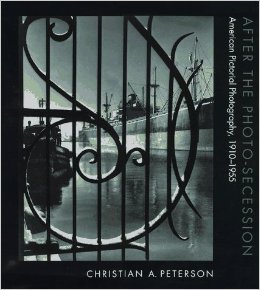
The first book is, After the Photo-Secession: American Pictorial Photography, 1910-1955. This book is out of print, but available pretty cheaply used.
After the Photo-Secession: American Pictorial Photography, 1910-1955
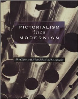
The second book is, Pictorialism into Modernism: The Clarence H. White School of Photography. Available both new and used.
Pictorialism into Modernism: The Clarence H. White School of Photography
If you’re a sucker for this kind of history, like me, you may find these two books very entertaining.
BTW, clicking on those images will not take you to Amazon, or anywhere else. I won’t sell books or anything on this blog, except my own work. I have no plans to monetize the blog in the conventional way and feel that if people are sufficiently interested in my work to follow this blog and to desire to support it, then they should be interested in supporting the blog by owning some my work, rather than by buying cameras, lenses, books, etc., etc. I do not begrudge others selling books for Amazon and cameras for Canon, etc., I simply won’t do it myself. If in fact my work is not good enough to support this blog, then quite clearly, the blog should not exist!
If you’re genuinely interested in fine art photography, then buy some. Mine. Anyone’s. If you’re not sure who, and you don’t like my work, I’ll be happy to make a recommendation. Even if you buy someone else’s work, I will consider that purchase as having supported this blog, if you simply got the idea here. The work of fine art photographers who haven’t yet won the art world magic lottery is so cheap compared to other art, as to be an embarrassment. I should be embarrassed to sell it that cheaply and you should be embarrassed to pay so little. 😉
And… most fine art photographers offer smaller images for entry level collectors, priced lower than dinner and a movie, myself included. Here are some of them. No excuse. If you love fine art photography, then support it in some way more meaningful than buying a book, or a new camera.
In the last post I promised to cover the images I showed you in prior posts, but for which I did not pursue a final print.
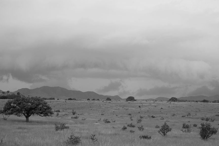
Split Rock… made several test prints. Couldn’t approach a tonal distribution I liked and aside from the interesting rock, it just seems less and less appealing overall. Maybe at a later time, but I don’t think so. It is just a photograph and doesn’t cross over.
Split Rock
Rock Abstract
Rock Abstract is kind of interesting, but probably doesn’t go beyond that. Don’t see much to pursue here.
Rock Abstract
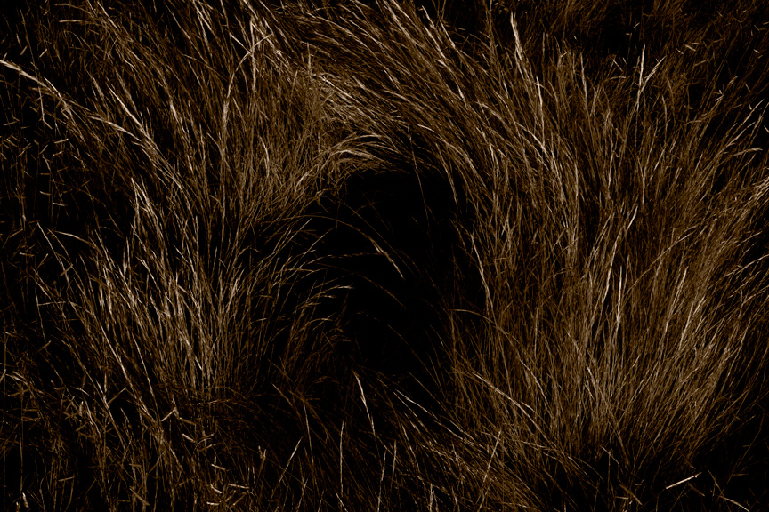
Grass Swirl
Grass Swirl is borrrrrring! And no, I don’t drink while I’m working. (And not much of any other time, either.)
Grass Swirl
Entrelazado (interlaced)
Not sure about Entrelazado. It might still have some potential. Might look at it again, down the line when I am reviewing previous rejects.
Entrelazado (Interlaced)
Images I Haven’t Shown You Yet, From Same Group
(Remember, these titles are temporary. First thing that pops into my head until I can change them later, IF I make a final print.)
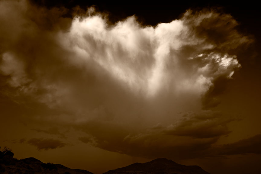
Cloud Fall
Cloud Fall is potentially a wonderful image. It remains to be seen if I can turn a two-dimensional disappointment into an illusion of three dimensions that conveys what I saw, which was quite spectacular.
Cloud Fall
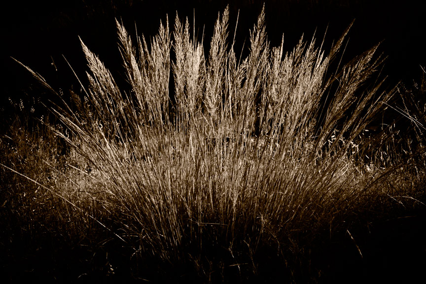
Grass Fan
Thought I might have something, probably too trite.
Grass Fan
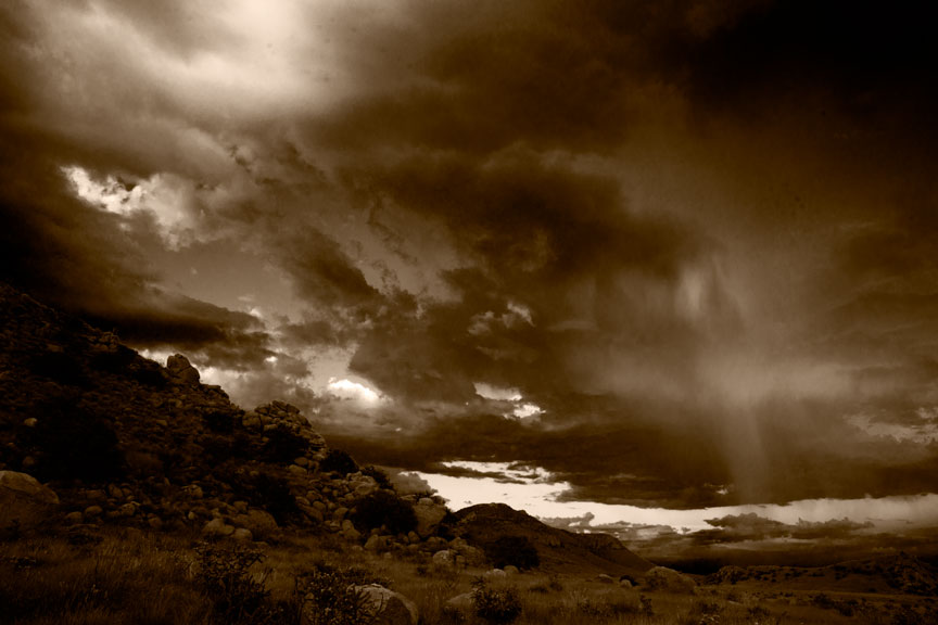
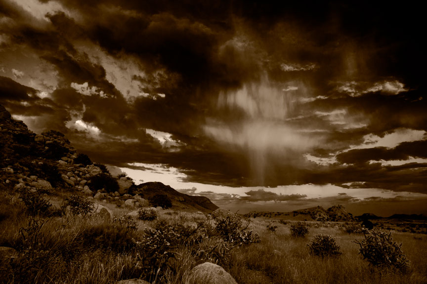
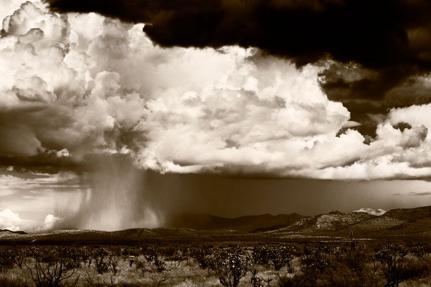
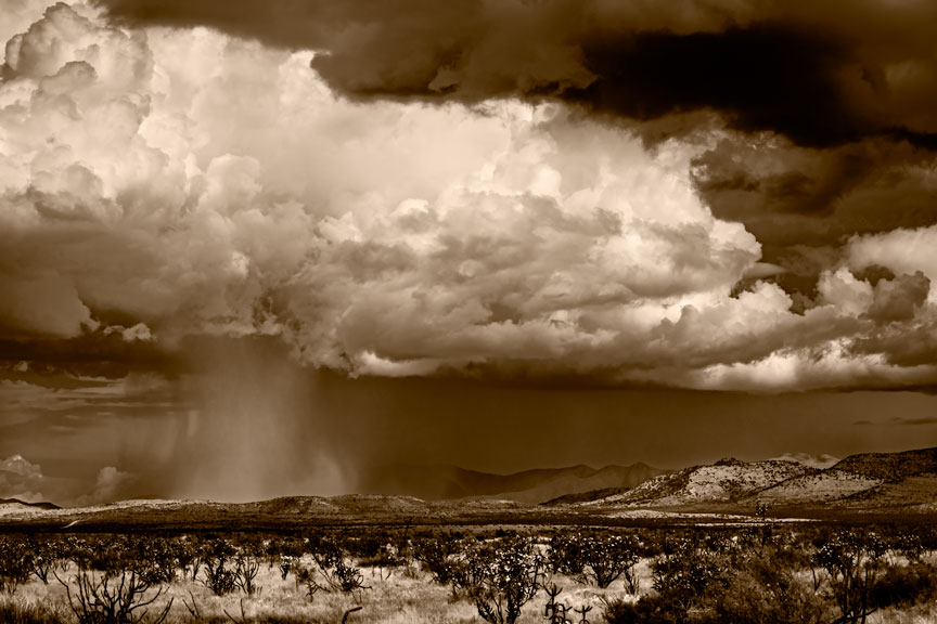
Rain Curtain I & Rain Curtain II
Two more images that ask the question, “Am I up to getting the most out of these?” (A question I ask myself, not infrequently.) So far, no. These were much more spectacular than what you see here. If I can get these to work, I will probably only show one of them. The problem I am having is with not being able to pull the sky together and maintain the subtleties while keeping it as visually spectacular as what I experienced. Need to start over from scratch. If I get anywhere, I’ll bring you up to date. Will probably end up working most on version two.
Rain Curtain IIRain Curtain I
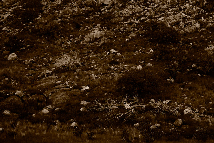
Rocky Hillside
It was kind of interesting. Maybe another time. Or another tonal approach.
Rocky Hillside
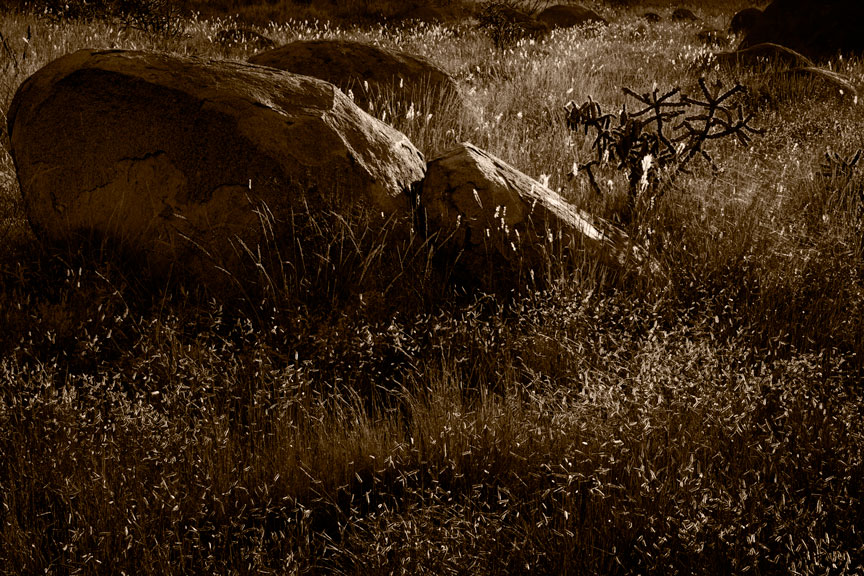
Three Rocks
I told you the titles were temporary! I kind of like this. Not really sure why. I may come back to it. Did some others that were really uninspired. This may just look good to me because it doesn’t stink quite as much. 😉
Three Rocks
Well, I told you at the outset you would get to see it all, the whole process, warts included. Not just the good stuff. These are the warts, with possibly one or two hidden gems.
In previous posts I have shown you unmodified versions and preliminary work ups of images I have captured over the last few months. Since I have just in the last week or so finished printing and matting a number of them, it is time to bring you up to date.
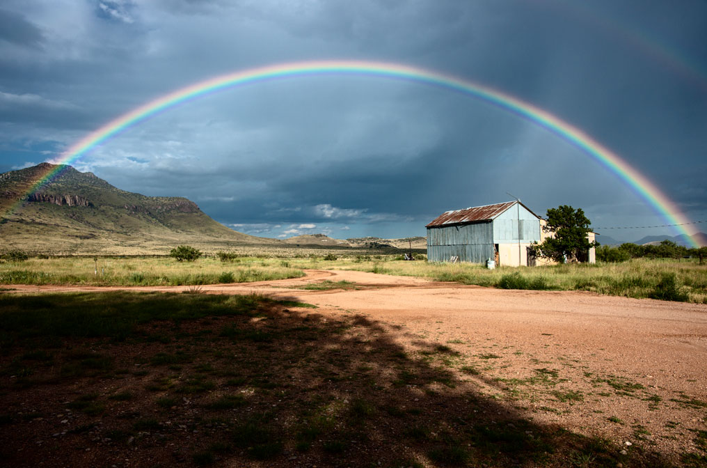
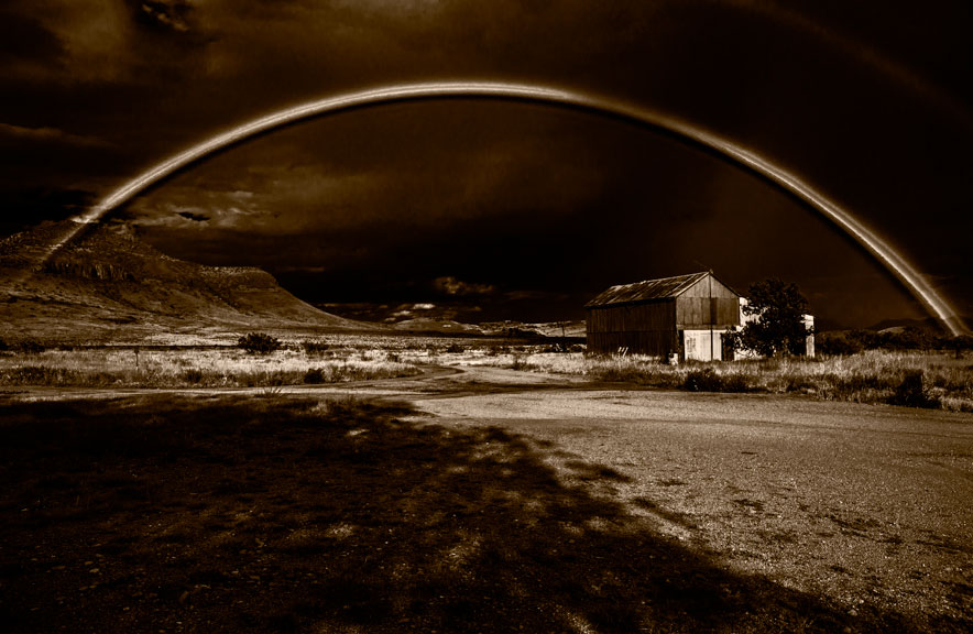
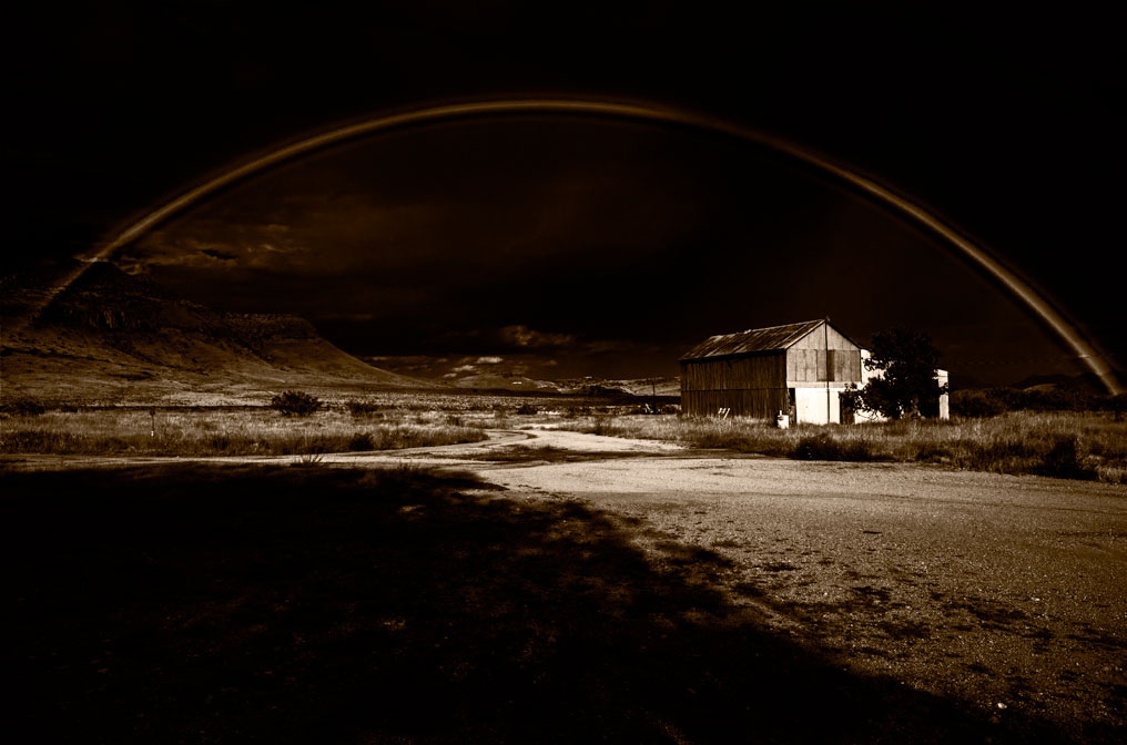
Rainbow & Shadows (I try not to be clever with titles)
The above image was a casual capture on August 16th of this year. Until I looked at the raw image there was no thought of anything but a record image. But in the end, this was printed…
Rainbow & Shadows
Which is not too far from the initial rough work up:
Rainbow & Shadows
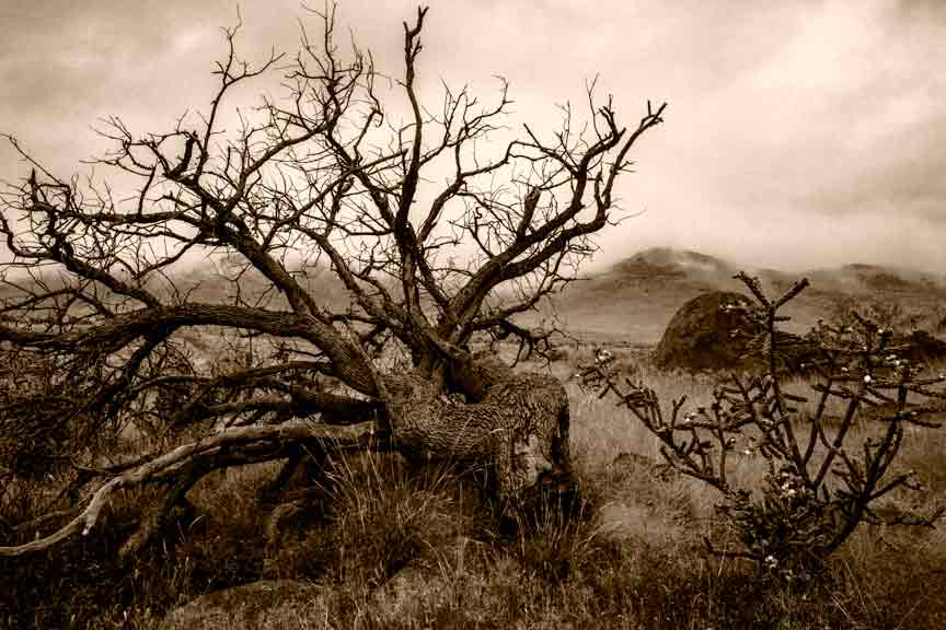
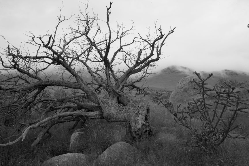
Dead Tree & Fog, and Encircled
In the last several days I showed final versions of the two images below. Dead Tree & Fog was shot on Sept 9th and printed Oct 7th.
Dead Tree & Fog
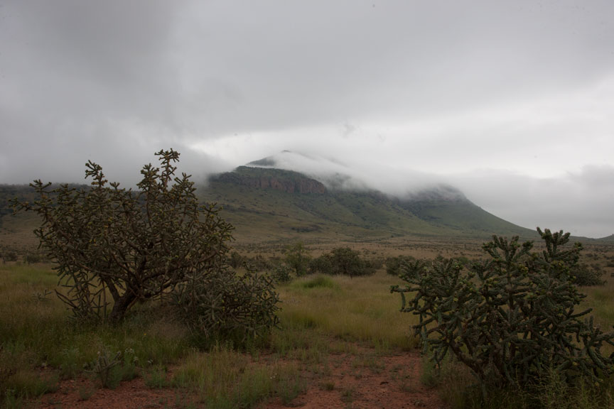
Encircled was captured Sept 11th and printed on Oct 14th. At first I thought there was nothing here, but changed my mind later.
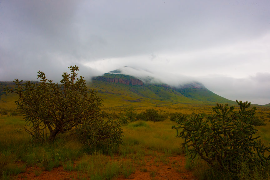
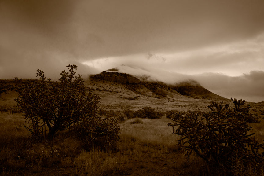
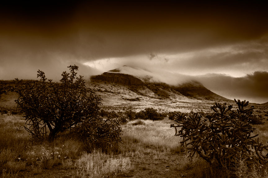
Morning Fog On Blue Mountain (as it came from the camera)Morning Fog on Blue Mountain (increased saturation)Morning Fog On Blue Mountain (initial work up)
This is the final image as printed:
Morning Fog on Blue Mountain
This had to be pushed pretty far. Every part of this image wanted to fall apart with the degree to which I was altering the gray tones. I had to back off a bit from what I wanted because it just wouldn’t hold together that far. This kind of image is the reason big sensors and lots and lots of megapixels are needed for fine art photography. Ideally, I would like to have about a 6×9 cm sensor with about 150 megapixels.
On Aug 8, I captured Vulture Corner, printed Oct 20th. This doesn’t translate at all well into a jpeg. This is actually the second printing. I had finished a version a few days before but just wasn’t completely satisfied with the middle ground. In the process of looking for improvement, I found another capture taken just a few seconds before that showed the vultures better, but was otherwise the same. Tore up the already made prints and printed the new image. It happens.
Vulture Corner
Vulture CornerVulture Corner (as captured)
One of the hardest things for people to understand is the difference between what we think we see, what we actually see and what the camera sees and records. What you see just above in the unaltered camera capture looks very different from what I actually saw. The image the camera captures is just as far from reality as what most people think they see when they look at a scene. The fine art photographer has to see what is actually there, what the camera is going to record and what is potentially there in a final print. All are very different. Many a vacation snap shooter has stood at the counter of a photo processor and complained, “I was there and it didn’t look like that!” That is because what was there and what they saw were two different things.
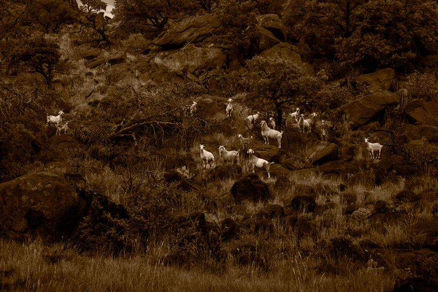
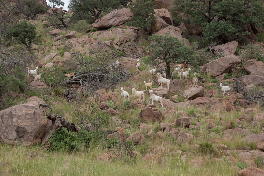
Goats on Lizard Mountain
I haven’t shown you this one yet, at all. Goats on Lizard Mountain was an end-of-the-day, spur-of-the-moment thing. These goats roam free and do not like to be approached, but they deigned to array themselves in a pleasing manner exactly once before trotting back up the mountain. It doesn’t look it, but this image is pretty heavily altered. The dark tone of the rocks compared to the light tones in them as seen in the unaltered original capture beneath, should give you an idea of the degree to which this image was pushed. Again with this image, I had to back off a bit because it started to crumble.
Goats on Lizard MountainGoats on Lizard Mountain (as captured)
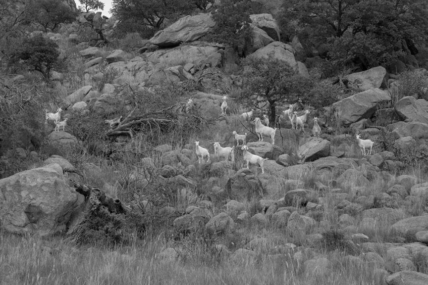
This doesn’t look like too tough an image until you see the same capture desaturated, below.
Goats on Lizard Mountain (desaturated)
This is why it needed a lot of wrestling with tonal distribution. Just increasing contrast would have resulted in a snappier version of dull.
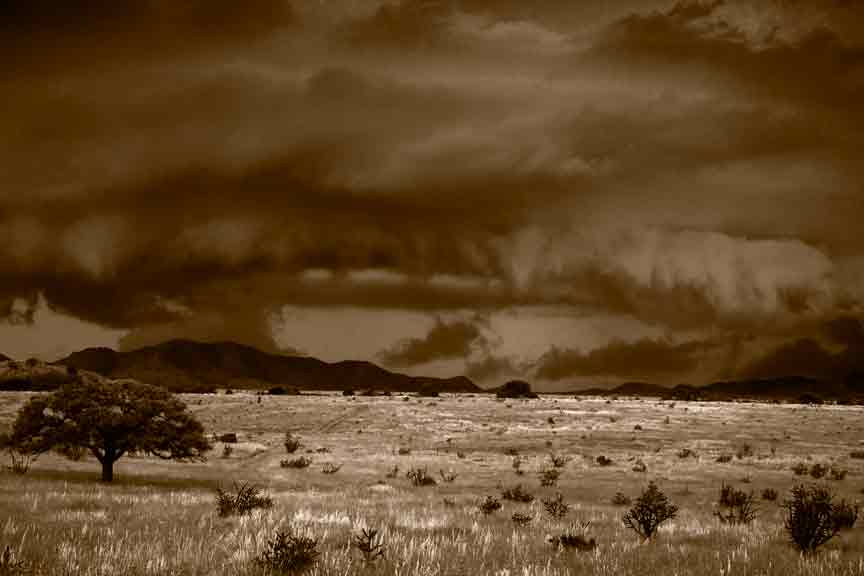
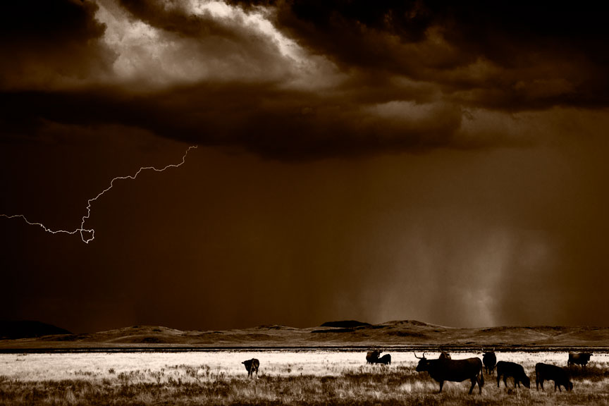
The other day I showed you Cattle And Lightningwhich was taken a couple of years ago, but never printed until now. It is not part of the group of recent images captured here on the ranch and is mentioned now only because it was printed at the same time as the others you are seeing.
Cloudburst East of Alpine
Lastly, there is one image shot in 2009, also not part of the recent group, but again printed with the same grouping. This was a very popular image. I have sold a number of these, but started being unhappy with it soon after the initial version was created. In fact, I was so displeased with it that I took it off my gallery walls quite a few months before closing the gallery July 1st.
This is another case where the image doesn’t translate into a jpeg at all well. The first interpretation looks better here than it does on paper, while the new interpretation below it, doesn’t look nearly as good as its printed version. The original was just too contrasty and it was also printed on coated paper, which I have since come to dislike intensely. (Red River Aurora Natural. This is very good paper as coated papers go; they’re just no longer my preference.) The new version is printed on Quiller Cold Press watercolor paper (similar to Arches Cold Press).
Cloudburst East Of Alpine (first interpretation)Cloudburst East Of Alpine (second interpretation)
You’ll just have to take my word for it that the second image is vastly superior to the first, even though the opposite may seem true here. It is full of subtlety that just doesn’t come through here. There simply is not, and probably never will be, a good way to translate the nuances of a fine art photograph to internet presentation.
That is the end of the recent printing session. It lasted about three weeks, not counting the initial work ups, which usually last no longer than ten or fifteen minutes. It takes one to three days to reach a final print for an image. Three days is rare, two days is common. Reaching final prints for two images in a single day is very uncommon and good cause for celebration (and usually for starting over on at least one of them, a few days later). Initial work ups usually take place on the same day as capture, or perhaps the next day. Serious printing might not occur for years, as you have seen.
You may recall a number of images show in previous posts that do not appear here. They didn’t make it to final prints, at least not yet. Tomorrow I will post some of those and try to explain why they have fallen by the wayside; some perhaps temporarily, others for good.
I tend to get wordy and forget to add images to posts. Tonight I sprinkled a few of the photographs of Arequipa Peru captured when I lived there, many years ago, into the posts that had no images. They have nothing to do with the posts in which I placed them, but having some images is better than having no images. Don’t complain, or I’ll put in charts and graphs, instead! Besides, its my blog and I can do what I want. Nyah, nyah.
Below are a couple more gratuitous images from Peru. You would be absolutely stunned at how little interest exists in Texas for images made anywhere not in Texas! Of course, I understand this regionalism is actually universal and not confined to Texas. Come to think of it, no one in Peru ever asked me if I had any images of Texas! (They did however, almost completely buy out the one-man show I had there and that seldom happens in other countries.)
Anyway, I get so little chance to show them off, I’ll take advantage here. If you don’t like ’em, I’ll post twice as many. 😉
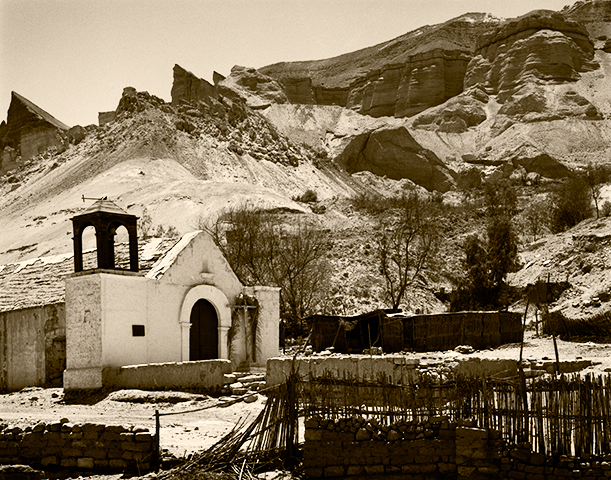
Church at Vitor (gratuitous image by the author, unrelated to the post)
Color is Easier Than B&W, But B&W Is Easier Than Color
As mentioned in the previous post, it is far easier to achieve a technically satisfying print in color than in B&W. That is because color contrast saves many photographs that would not succeed as straightforward B&W images. In this sense, color photography is much easier than B&W. But when one is attempting to reach the level of art, B&W is a far easier, and more flexible tool than color.
This is easy to explain. The overriding unique quality of the photograph is its illusion of reality. To destroy that illusion is to lose the best tool a fine art photographer has. As long as you can leave the viewer convinced that what he sees is/could be, real, you have maintained the integrity of the illusion.
The Following Interesting Information Added 11-01-2014…
There is nothing new under the sun. In another post, I recommended a couple of books including Pictorialism Into Modernism… where a few minutes ago I read (pg. 98) this sentence written by Gordon Aymar, and quoted from the 1924 Art Directors Club annual:
“… On the other hand, forced beyond the limits of its (the photograph’s) own inherent characteristics, it becomes false and loses that sense of reality which is its chief asset.”
Andenes (yet another image unrelated to the post)
But B&W Is Easier Than Color
With B&W, you can stretch an image a great deal and still maintain believability because the viewer has little basis to determine what gray tones might have existed in the original subject. The most common/popular manipulation is to darken skies. In reality, the sky is usually brighter, quite considerably brighter, than most anything and everything on the ground. But the human eye sees the deep blue of the sky as dark and therefore, readily believes a dark sky in a B&W photograph. Only on rare occasion is the sky actually darker than the ground.
Current practice among color photographers using digital tools seems to be to push the saturation slider as far to the right as it will go. This results in a gaudy, obviously manipulated, though attention grabbing image that has completely lost the illusion of reality a fine art photograph depends upon. (It does however, seem to sell well in shopping malls.) Because this illusion must be maintained, the manipulation tools available to the fine art photographer working in color are generally far more limited and therefore make the job of working in color more difficult. Very few can manage to do genuinely good work. Those who can, deserve full credit for the achievement.
With digital images destined to be monochromatic, colors can be saturated to the point of absurdity, yet once hidden behind a B&W layer such obvious extremes are completely disguised.
This is not to say that in order to fall under the heading of art a photograph must depart from reality (what people think is reality), but it is certainly easier and is a frequently employed tool. Rare indeed is the B&W photograph that has not been manipulated in some way to produce the result the photographer envisioned when the image was captured, even if only dodged and burned.
In a B&W image, people will believe even the greatest extremes. Trees ranging in tone from pitch black to the near-white produced by infrared films can all be acceptable illusions. Not so in a color photograph.
Clearing Storm Behind El Misti (all gratuitous images from Arequipa, Peru, late 1980’s)
Conclusion
It is easier to do good work in B&W because there are more tools and possibilities at the artist’s disposal for manipulation, but it is harder because the B&W image is so technically demanding. It is harder to do good work in color because there is so little that can be done to alter a color image and have it still remain credible, but it is easier because a color image provides the easy slam dunk of color contrast, that makes just about any print pleasing to the eye.
Some twenty-plus years ago I wrote a magazine article titled The Primacy of Local Contrast (it can be found in the list of monographs on the right hand side of the page to which that link leads). It was an enormous hit at the time. Kind of a buggy whip today.
Don’t get too wrapped up in that article. It deals with techniques and approaches that have largely gone by the wayside. Unless of course, you are still using film. Then, by all means.
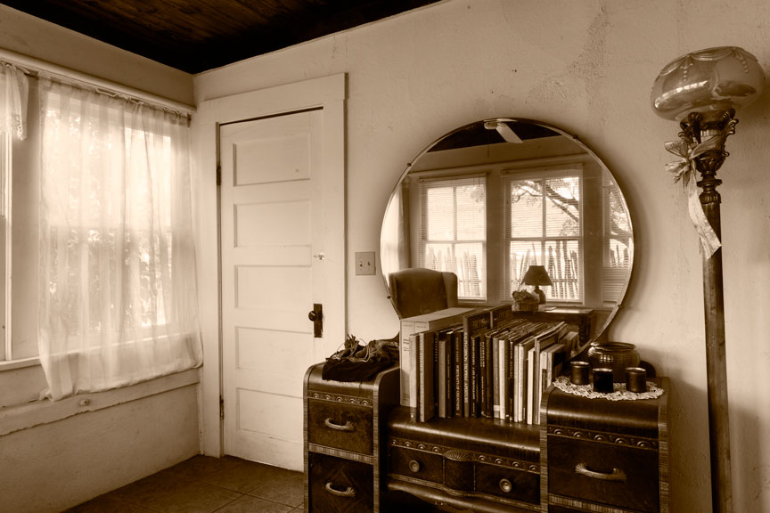
A blog on photography needs photographs. Here’ one that is completely unrelated to the topic Tone And Contrast In A B&W Photograph, at hand (almost). Just shot it today.
Winter Porch (just one of the really cool rooms in this wonderful old ranch house)
But the basic concepts of that article are still equally valid, if not more so. The B&W photograph is all about tone (brightness), contrast, and the relationships between tones. Most people don’t understand this. Without color, there is nothing but brightness and contrast. That’s all. The B&W photograph is about control over just those two things, but it’s a great deal more difficult than it sounds.
Color Contrast
This is why it is so much easier, in some respects, to pursue color photography. A color photograph has the added advantage of what is referred to as color contrast; the visual contrast between different colors. Two different image areas can have identical gray tones when photographed in B&W but radically different colors. A color photograph can be quite low in overall contrast and quite uniform in gray tone, yet still be appealing because of color contrast. Here is a practical example.
Color Contrast Only (All other forms of tone and contrast have been removed.)
When desaturated (remove all the color), the above image is all exactly the same gray tone; no contrast, no differences in tone, just one big gray rectangle. (I just tried it with the jpeg pulled off of this web page and something in the process of converting the Photoshop image to a jpeg leaves a hint of difference in the grays, but in the original, they are all identical.) This makes it easy to see how a photograph can be successful using only color contrast and how the same photograph in B&W could be no photograph at all.
This also demonstrates why it is less difficult to create a technically successful photograph in color than in B&W. In many cases, if you remove the color, there is little or nothing left. A B&W image requires different gray tones and of course, contrast. A color photograph can succeed on nothing but the colors.
Tonal Relationships
Below is an example of a teaching aid popular in how-to art books and classes. The question accompanying these illustrations is always, “In which view is the gray tone darker?” In reality, the gray tones are exactly the same. Adjacent a white tone it looks darker, the opposite being true when next to black. The point is not to be clever but to show how human perception varies depending on what surrounds a tone or color. In other words, to demonstrate the extreme importance of tonal relationships in a photograph or painting and how it can effect the final outcome. I have always felt this subject deserved far more in-depth discussion than it usually receives.
Tone comparison 1Tone comparison 2
Lest the reader underestimate the importance of tonal relationships in a photograph, in particular a B&W photograph, I refer you to the work of a brilliant contemporary fine art photographer, Carl Chiarenza. Mr. Chiarenza’s work, especially those images involving nothing more than pieces of torn paper, clearly shows the supreme importance of tonal relationships. In those cases involving unrecognizable subject matter/materials, there is little or nothing in the photograph but the relationships between tones, yet the photographs are clearly very successful. To understand Chiarenza’s work is to understand how and why photography can rise to the level of art. To paraphrase the great Minor White, ‘a fine art photograph is at once a photograph and yet, more than just a photograph’.
Overall and Local Contrast
Leaving out color contrast, since we’re talking about B&W photographs, there are only two types of contrast: overall contrast and local contrast. When people discuss contrast, they are usually referring to overall contrast. Overall contrast is assumed by many to be the range of tones from black to white, but that is not correct. Overall contrast is the rapidity with which tones change from black to white. The fewer gray tones in the middle, the higher the contrast. More gray tones in the middle and even the elimination altogether of the extremes of black and white, constitute low overall contrast.
Statements like “I like a lot of contrast in my photographs “, are a dead giveaway. Leaving out gray tones in the middle, for a stark image that is made up mostly of very dark and very light tones is not usually the path to a good image. A full range of gray tones with pleasing tonal relationships is far more often associated with success.
At this point, someone is likely to ask, “What about detail?” Well, there was certainly detail in the subject that appeared in front of your camera, but the only detail in your photograph is in the texture of the paper, assuming there is any, on which you printed it. Detail in the image itself is represented by differences in tonality within gray tones. More specifically, by what is called local contrast.
Think of a stucco wall in direct sunlight. The differences in tonality you see there in the texture of the wall constitute what is correctly termed local contrast. If sunlight rakes across that wall at an angle, the local contrast is more pronounced. If a cloud passes over the sun, blocking direct sunlight from the wall, local contrast is markedly reduced.
The Primacy of Local Contrast
When someone remarks that he likes a lot of contrast, he is most often really referring to local contrast and not overall contrast and indeed, local contrast always plays a key role in the success or failure of a B&W photograph.
Every image has one or two areas in which local contrast must be correct for the photograph to succeed visually. This is usually the area of primary visual interest, but not always. In that old article, I coined the term key contrast core for this part of an image. (In hindsight, I think I could have come up with a better term.) Once contrast in that part of the image is correct, the rest of the image can be constructed around it, if necessary, but often falls into place largely on its own. One can get away with a great deal in a B&W photograph, but if the key contrast core is too harsh or too flat, the photograph will simply never work, regardless of what else is done.
By the way, the key contrast core above, in that photograph of our winter porch, is the front of the dresser.
This is why that old article was called The Primacy of Local Contrast. In a B&W photograph, the number one technical hurdle is to get the local contrast correct in the key contrast core.
In conclusion, and as a lead in to the next post, it is much harder to achieve a technically good photograph in B&W than it is in color. But it is much harder to rise to the level of art in color, than it is in B&W.
The dogs (we have three) got restless this morning. Of course! It’s Sunday and I wanted to sleep in. Got up to put them out. It was still dark and I heard some very intense munching coming from one side of the yard. I thought Wendy had gotten hold of a bone (never in short supply on a cattle ranch, she loves them, but they always give her doggy-rrhea). The more I listened, the more it sounded like Wendy might have been the munchee! The muncher sounded more and more like a T-Rex. I was hearing massive jaws crushing something very substantial. I went back inside to find a flashlight, came out and directed it where I thought I would find Wendy. She was there, but…
A few feet from Wendy were four rather large feral hogs just outside the fence of our yard, calmly chewing away on who-knows-what. They appeared to be a couple hundred pounds each, and didn’t seem the least bit bothered by me shining a bright light directly in their eyes. Usually, feral hogs run the instant they think a human is anywhere near them. These didn’t even look up. Never skipped a munch. Got the dogs back in quickly before pig and dog got into a shouting match. Feral hogs can be extremely dangerous and Wendy has far more courage than sense. I thought she was going to challenge them, but she never did. Lucky for all concerned.
Encircled
In one of my first posts (“Everybody Has To Go To Work“) I reported a less than optimal result for that day’s photographing and showed a couple of afternoon images that I said were better than the morning’s take, but still not worth spending ink and paper on.
Well, I have learned over the years to go back over old work and always take a second look. Never throw anything out. Occasionally a gem is found amongst the rejects you correctly bypassed the first time and good images aren’t so common that any of us can afford to overlook one. In particular, if you start out the day capturing poorly seen images, improved work that might occur later in the day may be seen through eyes already tainted by disappointment. That was the case with this capture…
The first couple of looks at this image were not at all encouraging:
Encircled
A desaturated version looked like this:
Encircled (simply desaturated) not at all encouraging
NB: Desaturate images temporarily to get an idea of what is there tonally, but always revert to color. Remember, you need those colors for full control of gray tones.
A later review made me try a few test prints…
The results looked promising, but I just couldn’t get the sky right. In particular, the area of the circle of cloud on the far right that is brighter than the rest of the circle, I felt needed to be brighter still. Everything I tried gave what seemed to be too much or not enough brightness and it all looked artificial. Then I realized that was the wrong direction for this image, tried a test print without any alteration of that area. That was better. Finally tried just slight darkening and that worked.
Above the cloud ring the sky was very flat and lifeless, so a lot of contrast increase and burning was required. The foreground needed a heavy increase in color saturation so that contrast could be added there too. Otherwise it was quite lifeless also.
Encircled (finished image)
Above is the final print of Encircled, printed on a cold press watercolor paper, a brand called Quiller, which is sadly no longer available. I have a small stock of it remaining. (Virtually identical to Arches Cold Press, Quiller is/was slightly warmer and of course, less expensive.)
I’ve spent the last couple of weeks working up and printing some of the images shot here on the ranch over the last few months. Encircled went from being a complete reject, to one of the images I am more pleased with from those I have printed thus far. You just never know!
Cattle & Lightning
Here is another image that was found on a second chance tour of my files. I shot this a couple years ago and didn’t do anything with it until this past week.
Cattle and Lightning
Will show more final images over the next few posts.
I am thinking about making some videos of the process of making a print. Maybe post them on youtube and insert them into posts here. Don’t know how practical or difficult this might be. Getting to a final print is a very intense process for me, almost meditative and I am not at all sure that interjecting the video-making process might not just interfere too much, or cause me to lose track of my thought process.
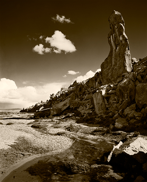
Stone Forest Obelisk (Department of Arequipa, Peru late 1980s)
It is a constant source of amazement, and provides a degree of entertainment too, how frequently I hear remarks about photographs being faithful to the original scene, as if that were somehow possible. The doctrine of straight photography has reached almost religious levels among some photographers. It is particularly amusing coming from some of the true believers in B&W fine art photography, those who follow straight photography as they believe it was espoused by group f64 and others, with perhaps a little too much zeal. I have even had a couple of people come into my gallery to make less than kind remarks because my work didn’t seem to meet their check list or because I had abandoned film for, gasp(!), digital.
These folks totally misunderstand the concept of straight photography as practiced by group f64 and others. They think that to be a straight photographer means to simply photograph a subject as it is, without changing it, and then to make a straight print on grade 2 paper. This is the best way to arrive at a really bland and uninspired photograph. Even some of the members of f64 thought that was what they were doing. But, that is just not possible.
Case in point: Edward Weston’s Pepper #30. This is the icon for the whole straight photography ideal. Pepper #30 is the photographic equivalent of the Mona Lisa. It is simply magnificent. But it is hardly a straight photograph, mostly because there can be no such thing as a straight photograph.
First, it is called Pepper #30 because it was the THIRTIETH attempt by Weston to get what he wanted. Hardly anyone is willing to try something thirty times to get just what they want. Even this is manipulation by elimination. And Weston did not just happen upon that pepper while it was reclining in a field somewhere. It was not photographed asfound as some would insist be done. Additionally, he tried numerous backgrounds before he settled on the old metal funnel he ended up using in this particular exposure because it modulated the light around the sides of the pepper just so. And he waited until the sun was at the right angle on the porch to give him just the sculpting he wanted. Straight photograph, my Aunt Fannie’s fanny!
The camera takes a three dimensional color scene, then flattens it to two dimensions, adding lens distortion and in the case of B&W, removing all the colors, replacing them with gray tones chosen by the manufacturer of that particular B&W film (all B&W films will render a subject differently), to be further altered by the chosen method of film development and the subsequent print making process.
Afternoon Clouds Behind Pichu Pichu (Arequipq Peru, late 1980s)
The popular mythology about straight photography is laughable. Straight photography is simply an approach to photography that eschews any attempt to make a photograph appear to be some other art form, such as painting. We do not print photographs on canvas, add brushstrokes in Photoshop, try to obscure the vision of the lens, smear paint on top of our photographs (talk about trying to look like a painting!) or do anything else to disguise the fact that the photograph is in fact, a photograph. This, for the same reason that pianists do not try to make their pianos sound like a tuba! However successful the pianist, a tuba will always do a vastly better job.
But when it comes to doing anything to shift the gray tones around, no holds barred; as long as the illusion of reality, the fine art photograph’s greatest asset, remains intact, the result is valid.
Even over-saturation of color images, which crosses the line to become offensive in all cases but one I can think of, is legitimate if the resulting image still maintains the illusion of reality. (The only photographer I know of who can pull this off successfully is Tony Kuyper, mentioned in my previous post. His work can be seen here: http://www.goodlight.us/writing/tutorials.html)
I suppose that technically, if it is used correctly and with effective creative result, it can’t be called OVER-saturation!
I left you a teaser the other day by saying that the best B&W images come without ever having to convert the captured digital image to B&W, at all. Time for the other shoe.
B&W photography is really all about color, whether you have adopted a digital approach or are still using film. This is because gray tones in a B&W photograph are determined by the colors in the subject and by the amount and color of the light falling on those subject colors and in turn, reflected by them toward the lens. And also by what the photographer does to manipulate those colors.
Way back in the Estarcene Era when cameras used film, B&W films did not all react to light and the various colors of light in the same way. First of all, there were films sensitive to blue light only, then to blue and green light (orthochromatic), and later to the full visible spectrum, blue, green and red light (panchromatic). Some of the most recent B&W films such as Kodak’s T-Max films have an extended sensitivity to red. And then there were what were called short, medium and long-toed films which, without boring you with the technical details, each altered the reaction to light and color in additional ways. This, by the way, made any attempt to predict or control the behavior of light and film outside of very broad parameters, absurd. And remember, you are hearing that from a former Zone System expert of some renown. (For those who are not familiar with the Zone System, that means I was a geek’s geek and a complete control freak. I’ve mellowed a bit, since.)
In addition, B&W films were designed to approximate, not what was actually in front of the camera, but what we photographers thought was in front of the camera. That is to say, the gray tones we thought we saw but weren’t really there, are what B&W film manufacturers strove to produce. This fact is no longer hidden from us with digital images, as can be seen in this digital capture, that is simply desaturated (all color removed, but leaving the brightness/gray tone), as many authors recommend:
Straight digital capture, desaturated
And remember that you are viewing this image by the transmitted light of your monitor which is much more contrasty than the reflected light of a print. On paper, this would be dull as dirt! Except for the bright clouds, this image is close to being one continuous, monotonous gray. It is all evenly illuminated by an overcast sky and therefore shows more or less the true light reflectance/gray tones as reflected by the different colors in the scene. Boring!
The reason for this is that colors in nature are seldom pure or anywhere near saturated. The blue of the sky is usually the most saturated color in a scene and that is the reason that the greatest effect of filters was often just to darken the sky. Photographers frequently had only that darkened sky as an option for putting some life into an image. Filters had less effect on the rest of a scene, or an effect different than expected.
In the end, it is amazing just how uniformly gray the world is.
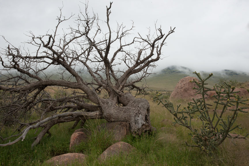
This is why film manufacturers adjusted the color sensitivity of B&W films. To provide a more natural result: or, what the photographer thought was more natural. In reality, the result wasn’t natural at all. Below is the unaltered color original of the gray image shown above. People look at a scene like this and see a lot of color, but there is really very little diffence in gray tone.
Dead Tree & Fog — no alteration at all
There was a fair amount of tone control available with B&W film and paper, especially during the last 30-40 or so years, when people were inventing new techniques left and right. I was responsible for well over a dozen of those new techniques. But digital… WOW! Digital tools make the techniques I invented look like toys by comparison.
Take what you could do with film and multiply that by 20, at least, for digital. But I do have to scratch my head when I read books and articles on B&W photography in the digital age. Most all of them begin with, “Convert your color image to B&W by way of method X, Y or Z”. There is absolutely zero reason to ever convert a color image to B&W by any method, especially if the result you are after is a B&W print. It is the colors in the captured image that allow you to create the B&W result you want. Never throw away the color in your images. If you do, you reduce your B&W options by about 98%.
As you can see from the two images shown above, if you are after a B&W image, in many cases color is most of what you have to work with because there are often not a lot of difference in light reflectance, and Photoshop (and I assume other software as well, but don’t know) has lots of tools for working with color.
In the digital age of photography a lot more can be done to manipulate the colors of an image with the goal of changing the final gray tones, than could ever be done with film and filters. The tools necessary are to be found in Adobe’s Camera Raw and then of course in Photoshop. (If you use other software, you may have some of these tools too.) Both are really necessary for best control.
Described simply, the approach is to saturate the colors so that they are more amenable to manipulation and then darken or lighten those colors. Then more conventional techniques such as the modern equivalents of burning and dodging can be used to further control the result.
As much work should be done in Camera Raw as possible because those tools are non-destructive while the tools in Photoshop are less so. 16 bit images are a must, because extreme manipulation is involved and 8 bit images will simply come unglued before you are even half way there.
The necessary color manipulation tools in Camera Raw are found in the Basic and HSL/Grayscale panels. In Basic there are Vibrance and Saturation sliders. Vibrance increases the saturation of colors that are poorly saturated. Saturation tends to affect colors that started out stronger to begin with. Vibrance is a useful tool and can only be controlled here. Saturation is better controlled on the HSL/Grayscale panel.
On the HSL/Grayscale panel there are three tabs, for Hue (you can change one color to another), Saturation and Luminance (brightness). Hue might be occasionally useful, but Saturation and Luminance are the tools you will need most. The rule here is simple, experiment! Don’t just increase the saturation of all the colors. That can be done with the saturation tool on the Basic panel. Overall saturation increases can run some colors into each other and cause image degradation in those areas in the final B&W image. Besides, you want to be able to control the saturation of colors separately in order to fine tune the gray tones of your images. There are hue and saturation tools in Photoshop, but the best place to do this is here in Camera Raw.
Save the image for further work in Photoshop, always as a Smart Object. This way you can go back to change what you did in Camera Raw as often as you need to, and you will need to on virtually every image.
You will notice on the HSL/Grayscale panel that there is of course, a Convert to Grayscale option. Don’t. Ever! This is the wrong place to do this and limits options considerably. That is too bad, because this feature has the option to control Orange which is very useful and oddly absent in Photoshop. Nonetheless, you lose far more than you gain by using this feature.
Once you have opened the image as a Smart Object in photoshop, you will need two layers right away (always work with layers, never on the image itself). First a Solid Color Fill Layer. Set the blending mode to Color, otherwise you will see just the color layer and not the photograph underneath it. If you want neutral gray tones (more on this another time), set the HSB values to 0, 0, 100. This is always the topmost layer. I am after brown tone prints, so my settings for this layer are: 43, 100, 12 (sometimes 13, depending on the paper I am using), in a ProPhoto RGB color space. Do this even if you are printing with Epson’s Advanced Black and White feature. It helps to see what you are doing.
Between the Solid Color Layer and the Smart Object layer, place a Black & White Adjustment layer. This is where you will alter the gray tones to suit the print you have in mind. If you need to change overall brightness or contrast, double-click the smart object layer to go back into Camera Raw and change those settings there. Also go back into Camera Raw to change saturation and brightness of individual colors to control what you get in Photoshop’s Black & White Adjustment layers.
Note that I did say layers just above and not layer. That is because you can have multiple Black & White Adjustment layers in Photoshop for vastly greater control. In Camera Raw, you are limited to only one Convert to Grayscale control, which by the way, turns off all of the saturation and brightness controls you previously set in the same panel. That makes the Convert to Grayscale feature a complete non-starter and utterly useless. Potentially a great tool, but wrong place and wrong implementation!
Just about done for today, but I should answer that question that popped into your head when reading the previous paragraph…
How can I benefit from multiple Black & White Adjustment layers? Masks. There are basically three digital classes of tools available for constructing a B&W photograph. (And constructing is the appropriate word.) They are:
Color manipulation
Traditional photographic tools: contrast/brightness/burning/dodging but with digital tools (quite different)
Masking
Masking is used to control which areas of an image are affected by any given layer. If you mask out part of the image on a Black & White Adjustment layer, you can use another Black & White Adjustment layer to control the gray tones in the part you masked out in the first layer. Why would you want to do that? Many reasons. An example would be an image that has two areas of the same color, one of which you want darker and the other lighter. More on the topic of masking at another time.
If you are new to the concept of masking in Photoshop, don’t rush out to buy a book on the subject. There isn’t one. The currently available books address masking for B&W images, and fine art photography in particular, little or not at all. They are far more oriented toward masking for commercial photographers. Most of these techniques are useless to fine art photographers. There is only one expert on the subject of masking for fine art photography and he hasn’t written a book. Fortunately, he has done just about everything else you might need. His name is Tony Kuyper and his tools and tutorials are available through his web site.
Tutorials page, with links to purchase the tools (not expensive): http://www.goodlight.us/writing/tutorials.html
His web site (see some of his extraordinary color images): http://www.goodlight.us
And his blog: http://tonykuyper.wordpress.com
While you’re there, don’t forget to nag him about writing a book!

")