
Color is Easier Than B&W, But B&W Is Easier Than Color
As mentioned in the previous post, it is far easier to achieve a technically satisfying print in color than in B&W. That is because color contrast saves many photographs that would not succeed as straightforward B&W images. In this sense, color photography is much easier than B&W. But when one is attempting to reach the level of art, B&W is a far easier, and more flexible tool than color.
This is easy to explain. The overriding unique quality of the photograph is its illusion of reality. To destroy that illusion is to lose the best tool a fine art photographer has. As long as you can leave the viewer convinced that what he sees is/could be, real, you have maintained the integrity of the illusion.
The Following Interesting Information Added 11-01-2014…
There is nothing new under the sun. In another post, I recommended a couple of books including Pictorialism Into Modernism… where a few minutes ago I read (pg. 98) this sentence written by Gordon Aymar, and quoted from the 1924 Art Directors Club annual:
“… On the other hand, forced beyond the limits of its (the photograph’s) own inherent characteristics, it becomes false and loses that sense of reality which is its chief asset.”
But B&W Is Easier Than Color
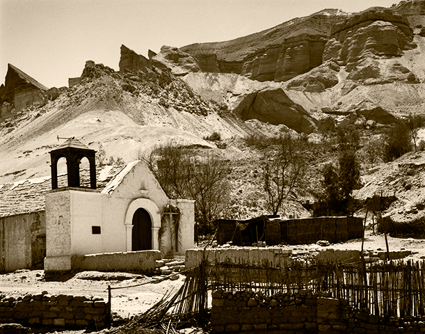
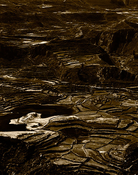
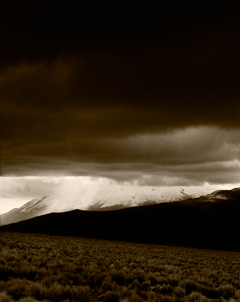
With B&W, you can stretch an image a great deal and still maintain believability because the viewer has little basis to determine what gray tones might have existed in the original subject. The most common/popular manipulation is to darken skies. In reality, the sky is usually brighter, quite considerably brighter, than most anything and everything on the ground. But the human eye sees the deep blue of the sky as dark and therefore, readily believes a dark sky in a B&W photograph. Only on rare occasion is the sky actually darker than the ground.
Current practice among color photographers using digital tools seems to be to push the saturation slider as far to the right as it will go. This results in a gaudy, obviously manipulated, though attention grabbing image that has completely lost the illusion of reality a fine art photograph depends upon. (It does however, seem to sell well in shopping malls.) Because this illusion must be maintained, the manipulation tools available to the fine art photographer working in color are generally far more limited and therefore make the job of working in color more difficult. Very few can manage to do genuinely good work. Those who can, deserve full credit for the achievement.
With digital images destined to be monochromatic, colors can be saturated to the point of absurdity, yet once hidden behind a B&W layer such obvious extremes are completely disguised.
This is not to say that in order to fall under the heading of art a photograph must depart from reality (what people think is reality), but it is certainly easier and is a frequently employed tool. Rare indeed is the B&W photograph that has not been manipulated in some way to produce the result the photographer envisioned when the image was captured, even if only dodged and burned.
In a B&W image, people will believe even the greatest extremes. Trees ranging in tone from pitch black to the near-white produced by infrared films can all be acceptable illusions. Not so in a color photograph.
Conclusion
It is easier to do good work in B&W because there are more tools and possibilities at the artist’s disposal for manipulation, but it is harder because the B&W image is so technically demanding. It is harder to do good work in color because there is so little that can be done to alter a color image and have it still remain credible, but it is easier because a color image provides the easy slam dunk of color contrast, that makes just about any print pleasing to the eye.