
Some twenty-plus years ago I wrote a magazine article titled The Primacy of Local Contrast (it can be found in the list of monographs on the right hand side of the page to which that link leads). It was an enormous hit at the time. Kind of a buggy whip today.
Don’t get too wrapped up in that article. It deals with techniques and approaches that have largely gone by the wayside. Unless of course, you are still using film. Then, by all means.
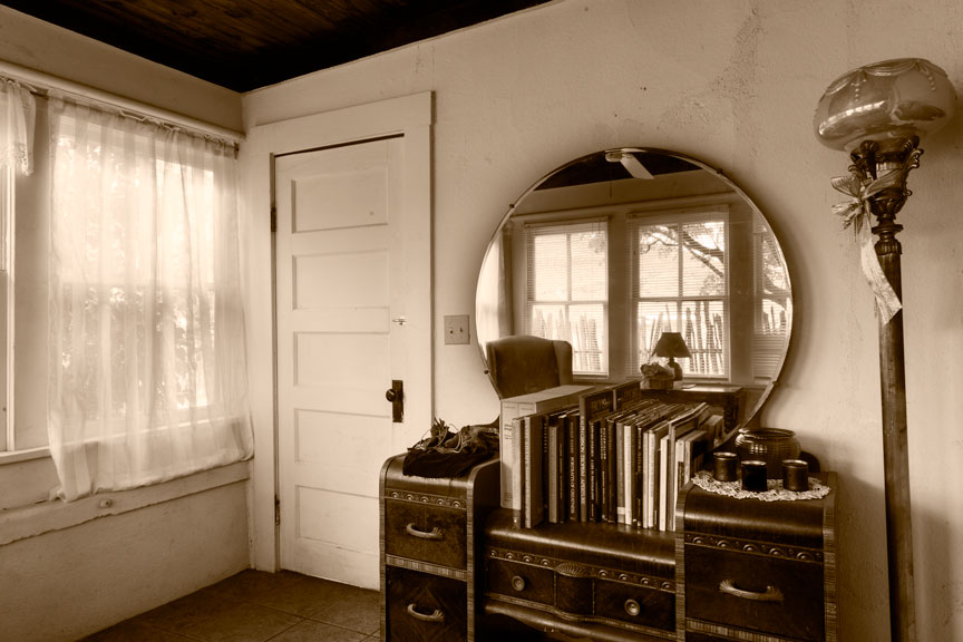
A blog on photography needs photographs. Here’ one that is completely unrelated to the topic Tone And Contrast In A B&W Photograph, at hand (almost). Just shot it today.
But the basic concepts of that article are still equally valid, if not more so. The B&W photograph is all about tone (brightness), contrast, and the relationships between tones. Most people don’t understand this. Without color, there is nothing but brightness and contrast. That’s all. The B&W photograph is about control over just those two things, but it’s a great deal more difficult than it sounds.
Color Contrast
This is why it is so much easier, in some respects, to pursue color photography. A color photograph has the added advantage of what is referred to as color contrast; the visual contrast between different colors. Two different image areas can have identical gray tones when photographed in B&W but radically different colors. A color photograph can be quite low in overall contrast and quite uniform in gray tone, yet still be appealing because of color contrast. Here is a practical example.

When desaturated (remove all the color), the above image is all exactly the same gray tone; no contrast, no differences in tone, just one big gray rectangle. (I just tried it with the jpeg pulled off of this web page and something in the process of converting the Photoshop image to a jpeg leaves a hint of difference in the grays, but in the original, they are all identical.) This makes it easy to see how a photograph can be successful using only color contrast and how the same photograph in B&W could be no photograph at all.
This also demonstrates why it is less difficult to create a technically successful photograph in color than in B&W. In many cases, if you remove the color, there is little or nothing left. A B&W image requires different gray tones and of course, contrast. A color photograph can succeed on nothing but the colors.
Tonal Relationships
Below is an example of a teaching aid popular in how-to art books and classes. The question accompanying these illustrations is always, “In which view is the gray tone darker?” In reality, the gray tones are exactly the same. Adjacent a white tone it looks darker, the opposite being true when next to black. The point is not to be clever but to show how human perception varies depending on what surrounds a tone or color. In other words, to demonstrate the extreme importance of tonal relationships in a photograph or painting and how it can effect the final outcome. I have always felt this subject deserved far more in-depth discussion than it usually receives.


Lest the reader underestimate the importance of tonal relationships in a photograph, in particular a B&W photograph, I refer you to the work of a brilliant contemporary fine art photographer, Carl Chiarenza. Mr. Chiarenza’s work, especially those images involving nothing more than pieces of torn paper, clearly shows the supreme importance of tonal relationships. In those cases involving unrecognizable subject matter/materials, there is little or nothing in the photograph but the relationships between tones, yet the photographs are clearly very successful. To understand Chiarenza’s work is to understand how and why photography can rise to the level of art. To paraphrase the great Minor White, ‘a fine art photograph is at once a photograph and yet, more than just a photograph’.
Overall and Local Contrast
Leaving out color contrast, since we’re talking about B&W photographs, there are only two types of contrast: overall contrast and local contrast. When people discuss contrast, they are usually referring to overall contrast. Overall contrast is assumed by many to be the range of tones from black to white, but that is not correct. Overall contrast is the rapidity with which tones change from black to white. The fewer gray tones in the middle, the higher the contrast. More gray tones in the middle and even the elimination altogether of the extremes of black and white, constitute low overall contrast.
Statements like “I like a lot of contrast in my photographs “, are a dead giveaway. Leaving out gray tones in the middle, for a stark image that is made up mostly of very dark and very light tones is not usually the path to a good image. A full range of gray tones with pleasing tonal relationships is far more often associated with success.
At this point, someone is likely to ask, “What about detail?” Well, there was certainly detail in the subject that appeared in front of your camera, but the only detail in your photograph is in the texture of the paper, assuming there is any, on which you printed it. Detail in the image itself is represented by differences in tonality within gray tones. More specifically, by what is called local contrast.
Think of a stucco wall in direct sunlight. The differences in tonality you see there in the texture of the wall constitute what is correctly termed local contrast. If sunlight rakes across that wall at an angle, the local contrast is more pronounced. If a cloud passes over the sun, blocking direct sunlight from the wall, local contrast is markedly reduced.
The Primacy of Local Contrast
When someone remarks that he likes a lot of contrast, he is most often really referring to local contrast and not overall contrast and indeed, local contrast always plays a key role in the success or failure of a B&W photograph.
Every image has one or two areas in which local contrast must be correct for the photograph to succeed visually. This is usually the area of primary visual interest, but not always. In that old article, I coined the term key contrast core for this part of an image. (In hindsight, I think I could have come up with a better term.) Once contrast in that part of the image is correct, the rest of the image can be constructed around it, if necessary, but often falls into place largely on its own. One can get away with a great deal in a B&W photograph, but if the key contrast core is too harsh or too flat, the photograph will simply never work, regardless of what else is done.
By the way, the key contrast core above, in that photograph of our winter porch, is the front of the dresser.
This is why that old article was called The Primacy of Local Contrast. In a B&W photograph, the number one technical hurdle is to get the local contrast correct in the key contrast core.
In conclusion, and as a lead in to the next post, it is much harder to achieve a technically good photograph in B&W than it is in color. But it is much harder to rise to the level of art in color, than it is in B&W.
dk