
I left you a teaser the other day by saying that the best B&W images come without ever having to convert the captured digital image to B&W, at all. Time for the other shoe.
B&W photography is really all about color, whether you have adopted a digital approach or are still using film. This is because gray tones in a B&W photograph are determined by the colors in the subject and by the amount and color of the light falling on those subject colors and in turn, reflected by them toward the lens. And also by what the photographer does to manipulate those colors.
Way back in the Estarcene Era when cameras used film, B&W films did not all react to light and the various colors of light in the same way. First of all, there were films sensitive to blue light only, then to blue and green light (orthochromatic), and later to the full visible spectrum, blue, green and red light (panchromatic). Some of the most recent B&W films such as Kodak’s T-Max films have an extended sensitivity to red. And then there were what were called short, medium and long-toed films which, without boring you with the technical details, each altered the reaction to light and color in additional ways. This, by the way, made any attempt to predict or control the behavior of light and film outside of very broad parameters, absurd. And remember, you are hearing that from a former Zone System expert of some renown. (For those who are not familiar with the Zone System, that means I was a geek’s geek and a complete control freak. I’ve mellowed a bit, since.)
In addition, B&W films were designed to approximate, not what was actually in front of the camera, but what we photographers thought was in front of the camera. That is to say, the gray tones we thought we saw but weren’t really there, are what B&W film manufacturers strove to produce. This fact is no longer hidden from us with digital images, as can be seen in this digital capture, that is simply desaturated (all color removed, but leaving the brightness/gray tone), as many authors recommend:
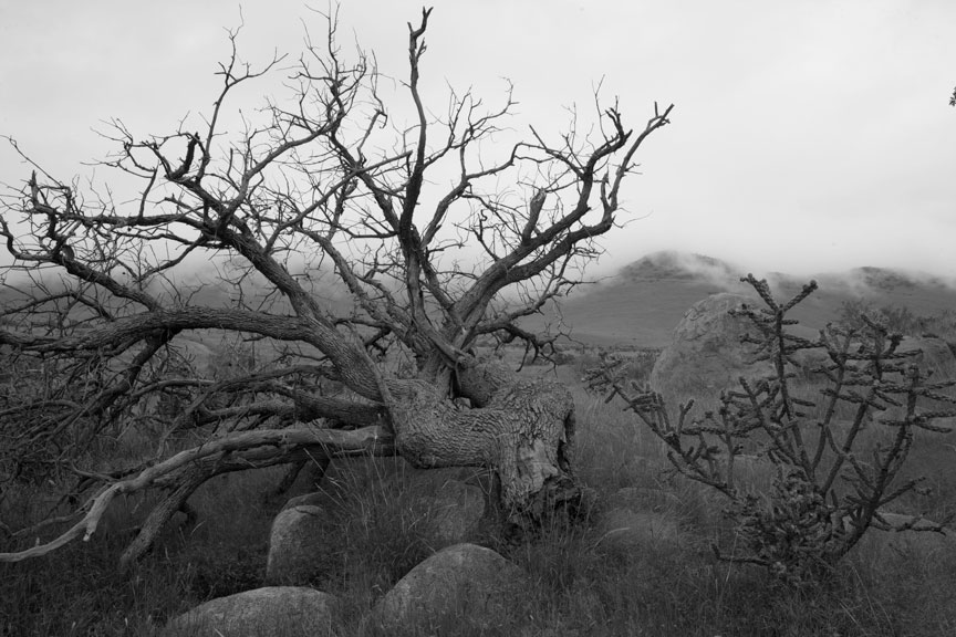
And remember that you are viewing this image by the transmitted light of your monitor which is much more contrasty than the reflected light of a print. On paper, this would be dull as dirt! Except for the bright clouds, this image is close to being one continuous, monotonous gray. It is all evenly illuminated by an overcast sky and therefore shows more or less the true light reflectance/gray tones as reflected by the different colors in the scene. Boring!
The reason for this is that colors in nature are seldom pure or anywhere near saturated. The blue of the sky is usually the most saturated color in a scene and that is the reason that the greatest effect of filters was often just to darken the sky. Photographers frequently had only that darkened sky as an option for putting some life into an image. Filters had less effect on the rest of a scene, or an effect different than expected.
In the end, it is amazing just how uniformly gray the world is.
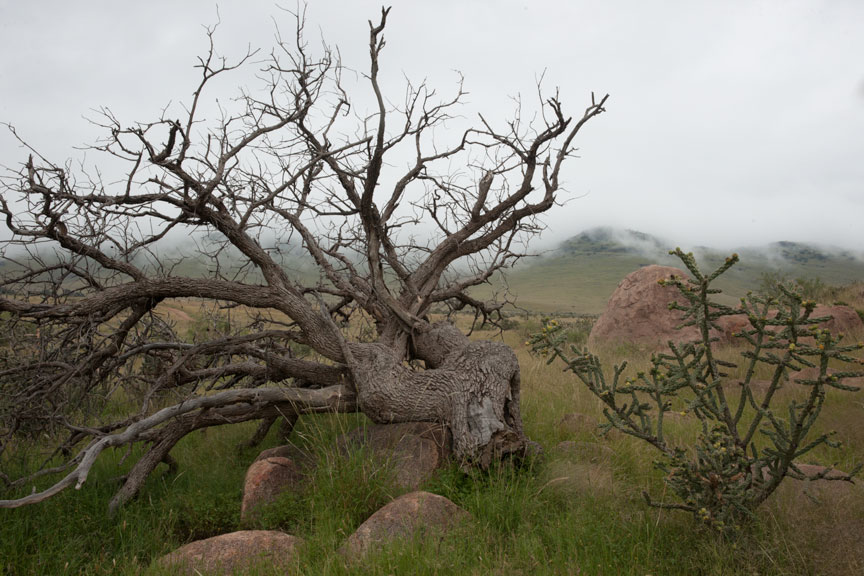
This is why film manufacturers adjusted the color sensitivity of B&W films. To provide a more natural result: or, what the photographer thought was more natural. In reality, the result wasn’t natural at all. Below is the unaltered color original of the gray image shown above. People look at a scene like this and see a lot of color, but there is really very little diffence in gray tone.
There was a fair amount of tone control available with B&W film and paper, especially during the last 30-40 or so years, when people were inventing new techniques left and right. I was responsible for well over a dozen of those new techniques. But digital… WOW! Digital tools make the techniques I invented look like toys by comparison.
Take what you could do with film and multiply that by 20, at least, for digital. But I do have to scratch my head when I read books and articles on B&W photography in the digital age. Most all of them begin with, “Convert your color image to B&W by way of method X, Y or Z”. There is absolutely zero reason to ever convert a color image to B&W by any method, especially if the result you are after is a B&W print. It is the colors in the captured image that allow you to create the B&W result you want. Never throw away the color in your images. If you do, you reduce your B&W options by about 98%.
As you can see from the two images shown above, if you are after a B&W image, in many cases color is most of what you have to work with because there are often not a lot of difference in light reflectance, and Photoshop (and I assume other software as well, but don’t know) has lots of tools for working with color.
In the digital age of photography a lot more can be done to manipulate the colors of an image with the goal of changing the final gray tones, than could ever be done with film and filters. The tools necessary are to be found in Adobe’s Camera Raw and then of course in Photoshop. (If you use other software, you may have some of these tools too.) Both are really necessary for best control.
Described simply, the approach is to saturate the colors so that they are more amenable to manipulation and then darken or lighten those colors. Then more conventional techniques such as the modern equivalents of burning and dodging can be used to further control the result.
As much work should be done in Camera Raw as possible because those tools are non-destructive while the tools in Photoshop are less so. 16 bit images are a must, because extreme manipulation is involved and 8 bit images will simply come unglued before you are even half way there.
The necessary color manipulation tools in Camera Raw are found in the Basic and HSL/Grayscale panels. In Basic there are Vibrance and Saturation sliders. Vibrance increases the saturation of colors that are poorly saturated. Saturation tends to affect colors that started out stronger to begin with. Vibrance is a useful tool and can only be controlled here. Saturation is better controlled on the HSL/Grayscale panel.
On the HSL/Grayscale panel there are three tabs, for Hue (you can change one color to another), Saturation and Luminance (brightness). Hue might be occasionally useful, but Saturation and Luminance are the tools you will need most. The rule here is simple, experiment! Don’t just increase the saturation of all the colors. That can be done with the saturation tool on the Basic panel. Overall saturation increases can run some colors into each other and cause image degradation in those areas in the final B&W image. Besides, you want to be able to control the saturation of colors separately in order to fine tune the gray tones of your images. There are hue and saturation tools in Photoshop, but the best place to do this is here in Camera Raw.
Save the image for further work in Photoshop, always as a Smart Object. This way you can go back to change what you did in Camera Raw as often as you need to, and you will need to on virtually every image.
You will notice on the HSL/Grayscale panel that there is of course, a Convert to Grayscale option. Don’t. Ever! This is the wrong place to do this and limits options considerably. That is too bad, because this feature has the option to control Orange which is very useful and oddly absent in Photoshop. Nonetheless, you lose far more than you gain by using this feature.
Once you have opened the image as a Smart Object in photoshop, you will need two layers right away (always work with layers, never on the image itself). First a Solid Color Fill Layer. Set the blending mode to Color, otherwise you will see just the color layer and not the photograph underneath it. If you want neutral gray tones (more on this another time), set the HSB values to 0, 0, 100. This is always the topmost layer. I am after brown tone prints, so my settings for this layer are: 43, 100, 12 (sometimes 13, depending on the paper I am using), in a ProPhoto RGB color space. Do this even if you are printing with Epson’s Advanced Black and White feature. It helps to see what you are doing.
Between the Solid Color Layer and the Smart Object layer, place a Black & White Adjustment layer. This is where you will alter the gray tones to suit the print you have in mind. If you need to change overall brightness or contrast, double-click the smart object layer to go back into Camera Raw and change those settings there. Also go back into Camera Raw to change saturation and brightness of individual colors to control what you get in Photoshop’s Black & White Adjustment layers.
Note that I did say layers just above and not layer. That is because you can have multiple Black & White Adjustment layers in Photoshop for vastly greater control. In Camera Raw, you are limited to only one Convert to Grayscale control, which by the way, turns off all of the saturation and brightness controls you previously set in the same panel. That makes the Convert to Grayscale feature a complete non-starter and utterly useless. Potentially a great tool, but wrong place and wrong implementation!
Just about done for today, but I should answer that question that popped into your head when reading the previous paragraph…
How can I benefit from multiple Black & White Adjustment layers? Masks. There are basically three digital classes of tools available for constructing a B&W photograph. (And constructing is the appropriate word.) They are:
- Color manipulation
- Traditional photographic tools: contrast/brightness/burning/dodging but with digital tools (quite different)
- Masking
Masking is used to control which areas of an image are affected by any given layer. If you mask out part of the image on a Black & White Adjustment layer, you can use another Black & White Adjustment layer to control the gray tones in the part you masked out in the first layer. Why would you want to do that? Many reasons. An example would be an image that has two areas of the same color, one of which you want darker and the other lighter. More on the topic of masking at another time.
If you are new to the concept of masking in Photoshop, don’t rush out to buy a book on the subject. There isn’t one. The currently available books address masking for B&W images, and fine art photography in particular, little or not at all. They are far more oriented toward masking for commercial photographers. Most of these techniques are useless to fine art photographers. There is only one expert on the subject of masking for fine art photography and he hasn’t written a book. Fortunately, he has done just about everything else you might need. His name is Tony Kuyper and his tools and tutorials are available through his web site.
Tutorials page, with links to purchase the tools (not expensive): http://www.goodlight.us/writing/tutorials.html
His web site (see some of his extraordinary color images): http://www.goodlight.us
And his blog: http://tonykuyper.wordpress.com
While you’re there, don’t forget to nag him about writing a book!